This past weekend I did a little cloud study from a photo and some notes that I took when we visited Salem, MA a couple weeks ago. I timed myself at an hour and the results were good, but feel kind of… eh.. to me.

Cloud Study (Salem) : Oil on board. 8″x10″ 2014
So I picked up a few of my books on color theory and began reading through some of the key points again,and I think what really sticks out as good advice is to consciously make a decision about what the colors in your paintings are going to be. Yeah – sounds obvious and an artist has to do that anyway right? Kind of. If I’m painting a sky initially I’m going to respond to the color I see before me, and the colors that are in the photo reference. Except I don’t have to. With some forethought and decision making I could make the same sky purple, yellow, or red and still have the potential to have good results.
So as an exercise I painted out a Munsell color wheel and value chart to keep around the studio. Munsell forwent the traditional color wheel of Red, Yellow, Blue (primaries) and Green, Orange, Purple (secondaries). His color wheel has five primaries and five secondaries, allowing a greater nuance of complimentary coloring. The tints in the middle of mine are a bit dark, but it is a useful tool to keep about.
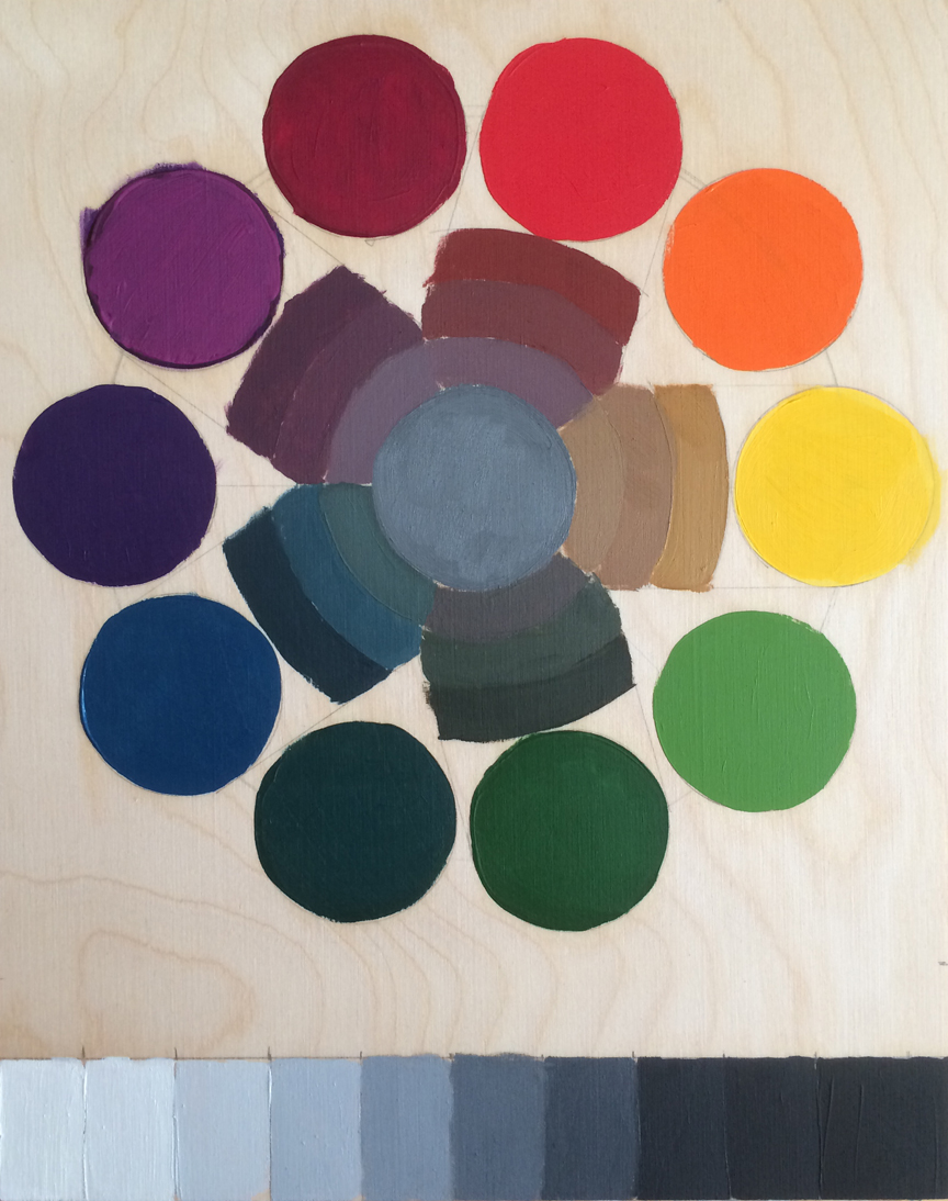
Munsell Color Wheel. Oil on plywood. 8″x10″ 2014
