First Painting of 2018

Winter vacation wasn’t as productive as I’d hoped.  The blast of cold weather and a lingering head/chest cold had me focused more on Netflix and the couch rather than painting.

But with a new year in place I tried to shake off the cobwebs and get back to work.

Twinkie Painting

“untitled” : Oil on wood panel. 6″x8″ 2018

Incidentally, this is also the first time I’ve ever tasted a twinkie.

Catching up

Catching up on posting some work that’s been in the works.  The past few weeks have seen the completion of a new painting for Echoes, a commissioned painting for a wedding present, and scrambling to get everything organized for Brickbottom Open Studios!

Since I haven’t finished the commissioned landscape or photographed the Echoes painting, here are a few new pieces of candy:


Green and Orange and Green

Still playing with surface, reflections, throw-away-culture, and a limited palette.  These have moved somewhere past the exercise of the candy and beer cans and slightly into an idea.


Shiny Shiny

This month I spent a week in Maine painting landscapes (images coming soon!).  The experience once again drove home how challenging landscape painting is for me: from siting locations, to handling trees, to edge control, to atmospheric perspective.

So as a treat to myself when I returned home I spent this weekend doing studies of hard-edged, candy-colored, shiny things.

The cans were painted in 3 and 4 colors with a large brush – again, pushing myself away from the detail work I normally do. The red candy was 3 colors, but I did allow myself to use a small brush.

A study and some exercise.

It’s been a couple weeks since my last post – not because I wasn’t painting, but because the painting wasn’t done. I’m planning another larger scale landscape painting and I spent a week working on a smaller study. It was helpful in assessing the areas that will be challenging on the larger scale: keeping the ground transparent and textured, being aware of temperature relationships, and figuring out how to paint a goddam tree without leaves on it.

I’ve also been ramping up my landscape painting in general because I go on vacation NEXT WEEK!  We’ll be back up in Acadia park and I will be scrambling over hill and dale trying to find a place to paint.  Every year past has followed a similar routine: the first day out painting is like learning to ride a bike all over again -usually resulting in a wasted day/painting.

This week I did a one-half-plein-air painting of the billboard next to my house through an open window.  And yesterday I put on my go pack and biked out to the Charles River to complete a mediocre painting.  Just as predicted above it was a bit of starting from scratch.  Hopefully that will all be gone by the time I get to Maine.

Silver

Another week, another beer can study.  I returned to small brushes and returned to my normal style after last week’s experiment.  Next week I may take the experiment in the opposite direction and do a layered/glazed painting of a can.  The printed aluminum is an ideal candidate for glazing and getting really deep, rich colors.

Big brush

I challenged myself to do this painting using a 3/4″ filbert brush instead of the 1/2″ and 1/4″ flats I normally use.  The flat brushes let me paint crisp edges and thin lines.  The filbert was an exercise in letting go and loosening up.  I also added a couple extra cans to push me for speed.

Corona

Another shiny beer can.  I think I’m going to attempt a different sort of back drop next time.  For the past several paintings I have spent an hour or two on the main subject, then mixed a greyish white with a bunch of medium to quickly paint in the background.  It leaves the objects hovering in some weird non-space.  I like that at some points, but I think it may also feel a bit formulaic.

Cons: the shadows on the white can were hard to get the color temp just right.

Pros: It was surprisingly fun to paint the calligraphy upside down.

Cherries

Once again I’m reminded that Alizarin Crimson is a cruel lover when painting directly.  I was able to overcome the transparency of the pigment, but the lower reflected lights came out a little hot-pink and a little to bright in value. Welp… I have half a bag of cherries left so we’ll see what happens next time.

Tree. House.

This weekend was a bit weird and emotional losing Rocket.  However, there were some bright spots:  On Friday evening I sold the large of waves paintings to a gentleman who saw my work at Open Studios.  I also handed off An Old House to it’s new owner.

And I wrapped up a new painting on Saturday, and did a little sketch on Sunday. The red house painting is finished – I think.  I wonder if it needs more detail.  I’ll have to revisit it in a week or two to see if I feel the same then.

Plastic Cup

This is something new.  Partially inspired by the cans and candy paintings, but also more of an idea forming in the background.  This particular study was extremely challenging, and is not exactly what I was going for, but is headed in the right direction.  Perhaps there will be more.

Plastic Cup 1

untitled (plastic cup) : Oil on Board. 14″x18″  2016

Feeling blue…


A set of studies from this past week/weekend.  I find myself drawn to the reflective and hyper-saturated colors of manmade objects more and more. They are a completely different challenge than landscapes: hard vs soft, defined edges vs atmosphere, saturated colors vs a millions shades of neutral.


All of the donuts!

Still continuing the sweets theme this week.  A couple more donuts added to the collection.  I’m happier about the surface of these two: the jelly had to be wiped off and repainted at one point to better understand the sugary texture on top.

However, both suffer a bit in the shadow area in the bite.  I’m not sure exactly what to mix to convey shadows that are both cool, deep, and yellow… every time I mixed up the colors I came out with something of a grey green approximation.  Maybe the next study will be a focus on just that part.

Enjoy.

So sweet it makes my mouth water.

I started this series as an exercise using a couple of pieces of candy from works by Felix Gonzales-Torres.  They are oil on 6×8″ wood panels.   My friend Zachary urged me to push the idea a little further, so I perused the candy aisle of the grocery store, bought a few models, painted the ones I liked, and ate those I didn’t.

The allure/challenge with these pieces was reflections and transparencies, and the rich colors.  Reflective surfaces are difficult to map out and depend a great deal on subtleties of value.  However, when done correctly, I find them rewarding.

I also enjoyed that I didn’t have to think much about the idea.  I had a pile of candies to choose from, and a pile of painting surfaces ready to go.  But the danger I see in pushing this series much further is falling it a groove of formulaic repetition.

The sweet-hearts was a one-off done on Valentine’s day.


Candy and Flowers

And it’s not even Valentine’s Day.  Three paintings from the weekend.  The models for the two candies are from Felix Gonzalles-Torres’ artworks, in which viewers are invited to take away candies from large piles.

Landscape, Nude, Still Life

Did three more small paintings over the weekend.  The nude was the most difficult again.  If you ignore the weird face and the misshapen hand on the right I’m happy with it.

The landscape was fine, just an exercise to jump start me painting.

The still life was done fast and poorly and was so offensively uninteresting that I wiped it off as soon as it was done.

Small Works over the Weekend

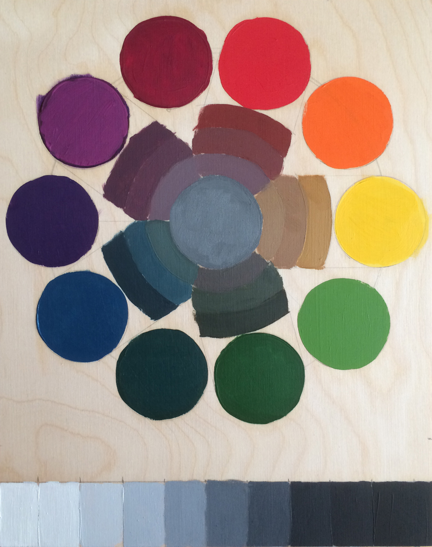
Ive decided to keep up the small painting projects.  I find them helpful in learning about color, composition, and value.  Also they aren’t quite as intimidating as a 4 foot expanse of canvas.

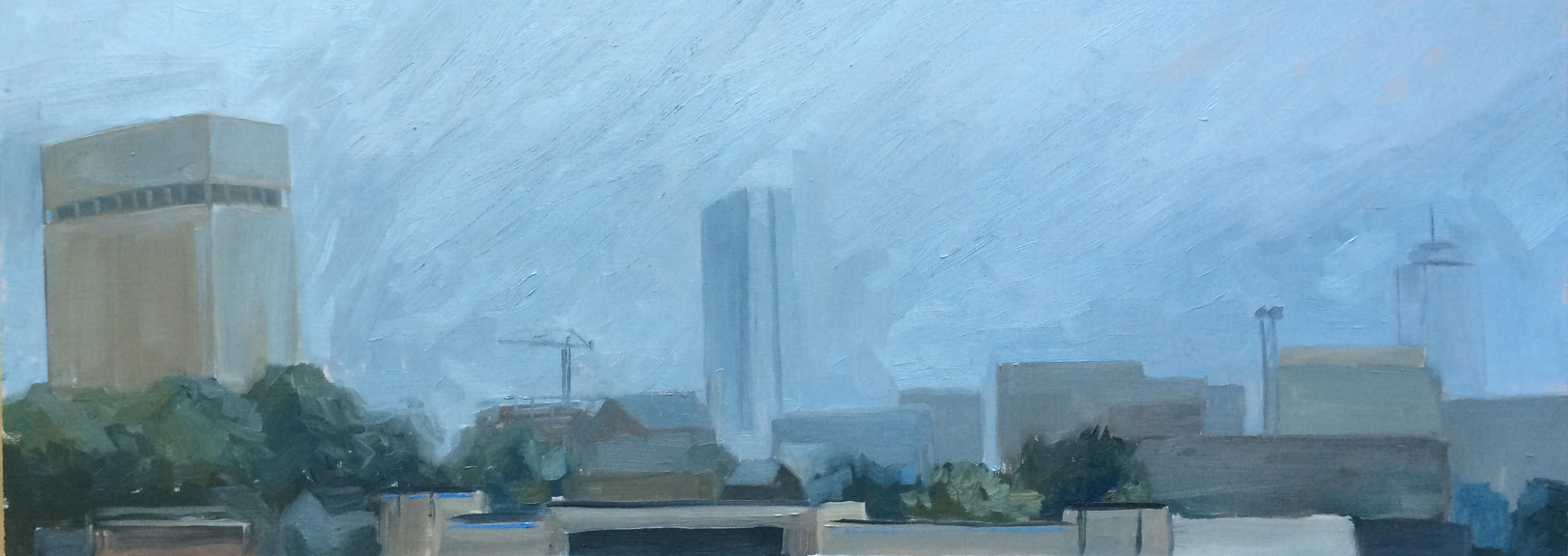
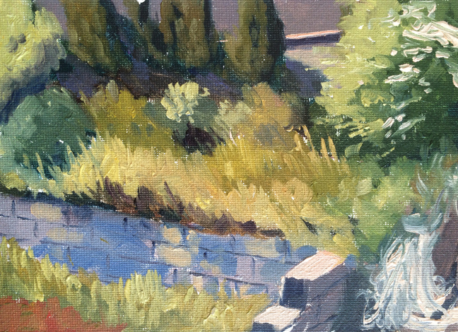
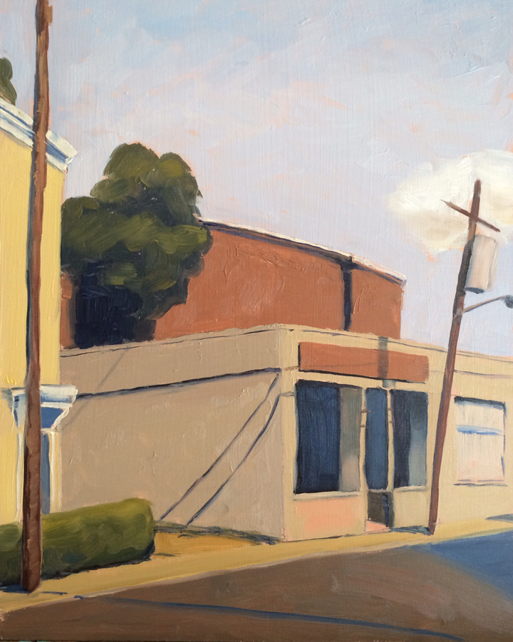
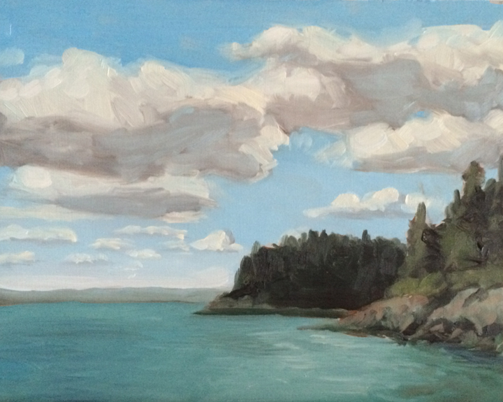
This weekend I did a flurry of paintings over 4 days.  I started with looking out the window at the view of east Cambridge.  The lower half of the painting is somewhat lost, but I’m happy with the courthouse tower and the trees around the tall building.

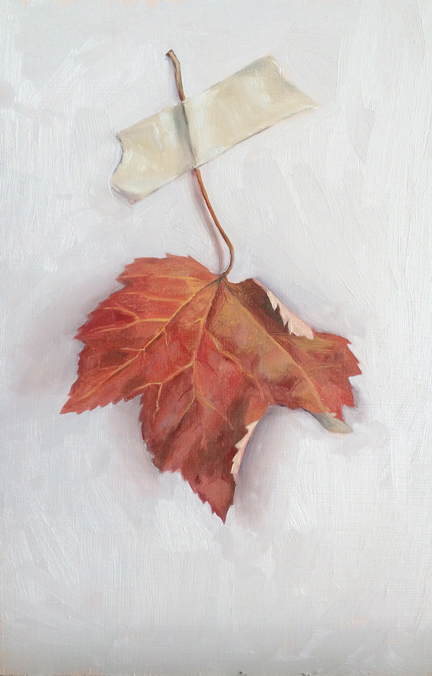
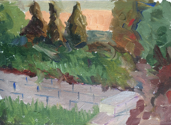
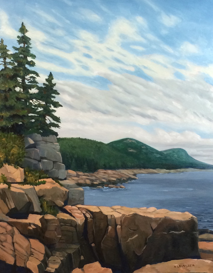
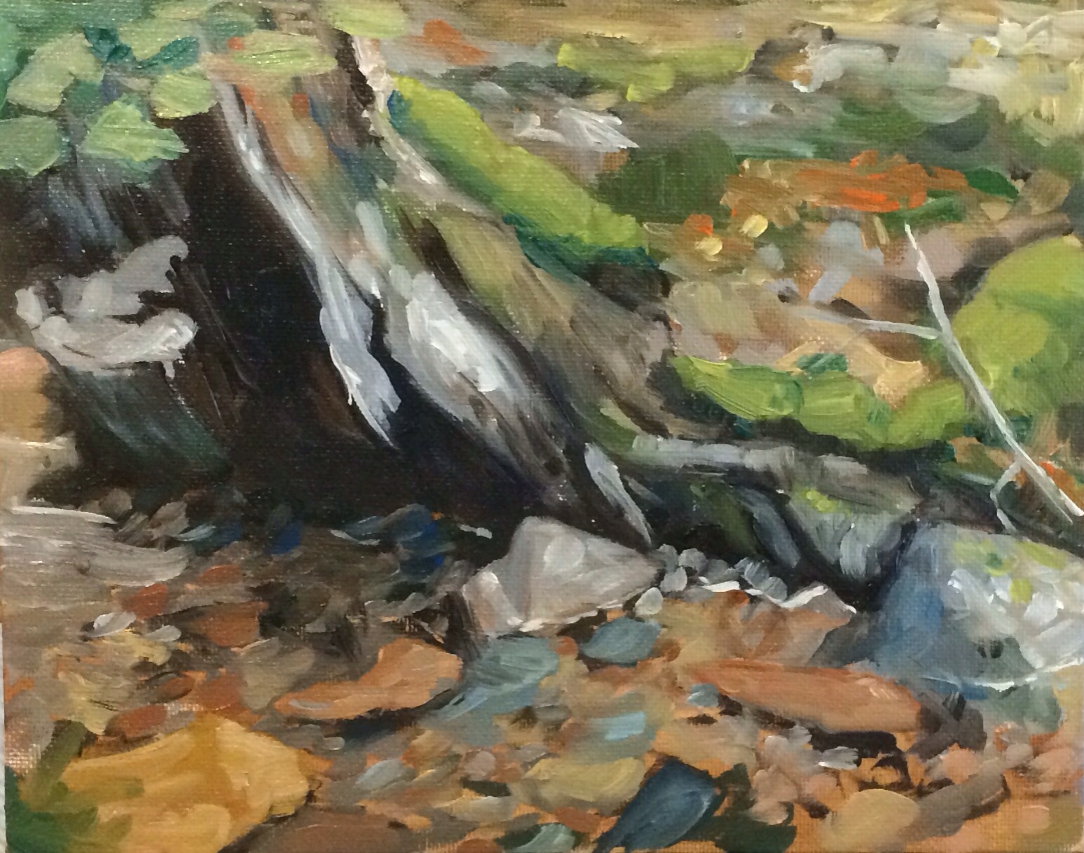
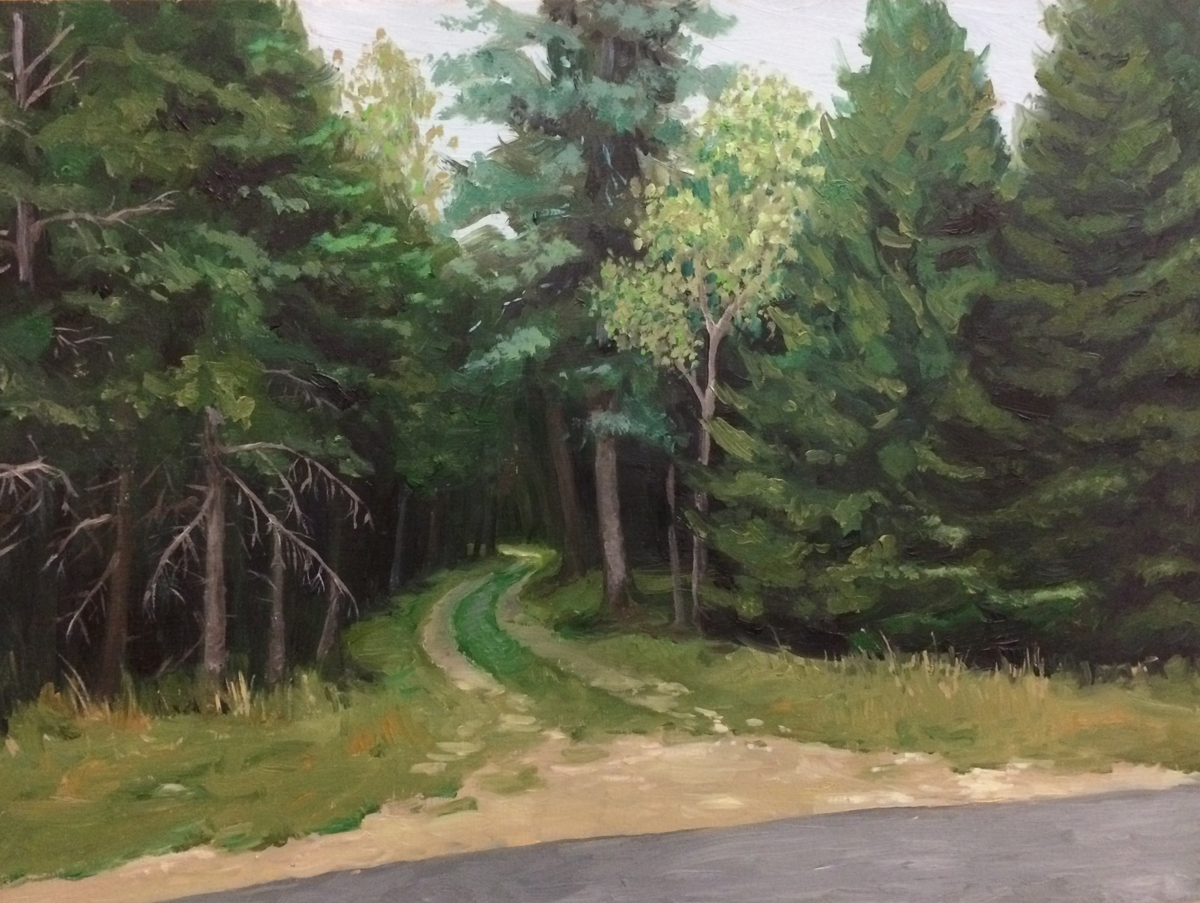
The second painting was from a photo of Maine.  I am both pleased and annoyed with this painting.  While the underlying structure came out correct, I was in a hurry when I painting the light plane of the tree trunk in and it feels generic.

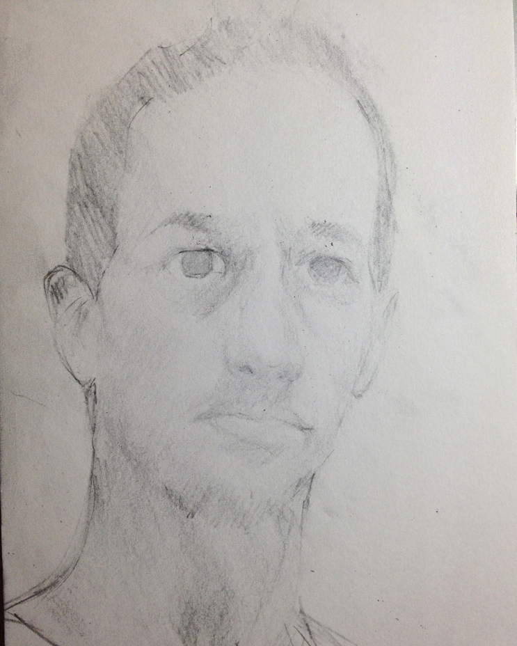
On a snowy Saturday I tried out a portrait experiment, once again working from a photo.  While the resemblance from the model is definitely off, I like the looseness of it.  When I paint I tend towards tight control of detail, so relaxing a bit was both exciting and frustrating.

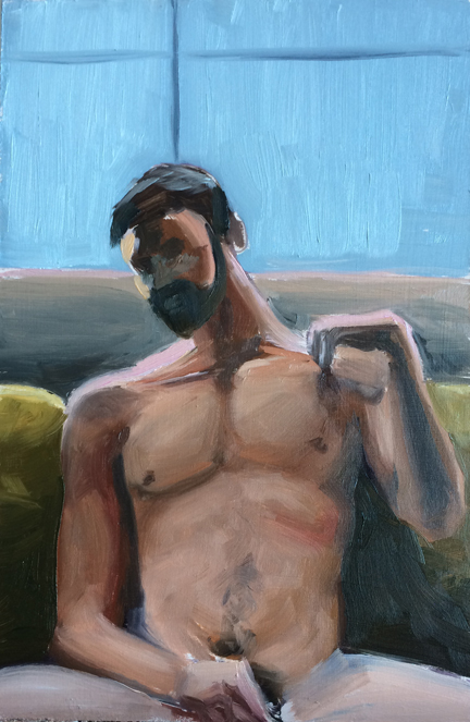
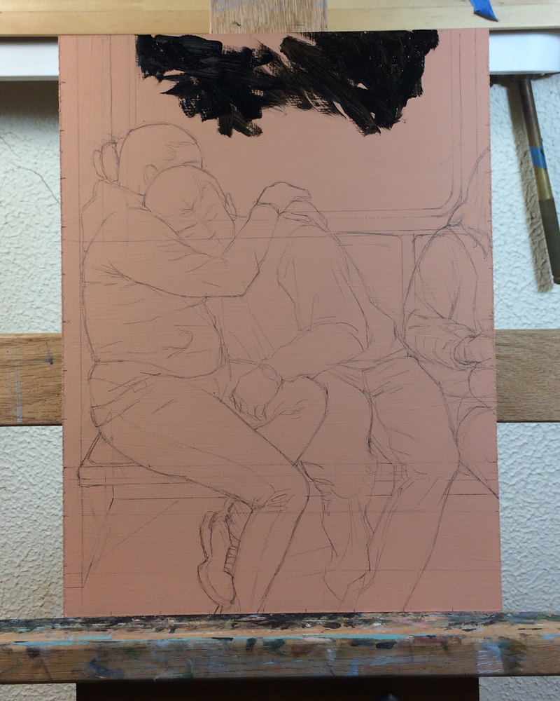
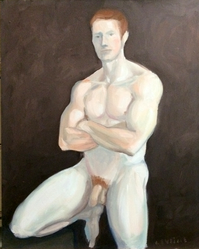
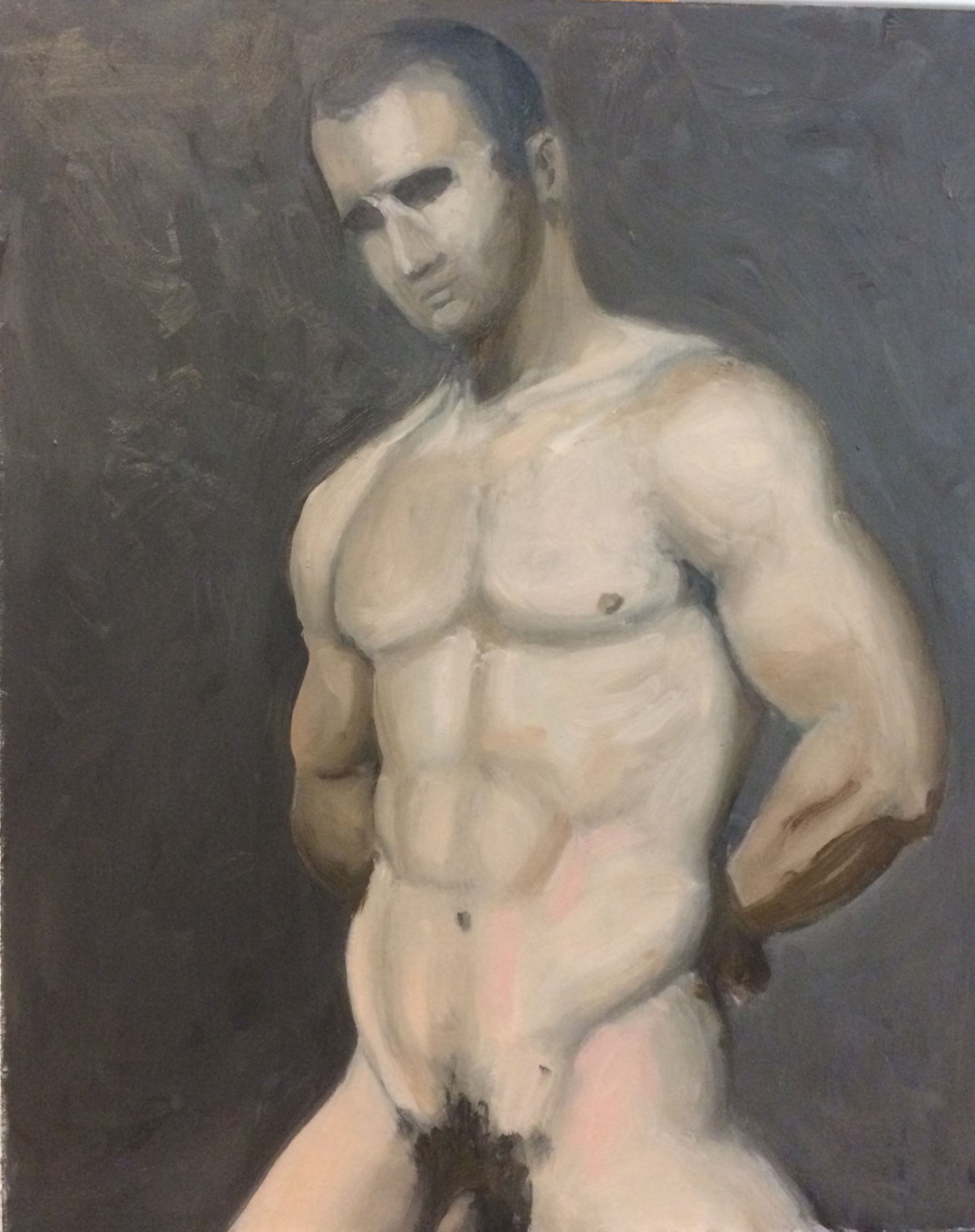
I followed up the portrait with a botched figure study that was so bad I’m not even including it.  However, Sunday night I came back to the easel to try again and am somewhat satisfied.  As I said to Lance: Once I figure out color mixing, values, and anatomy, I might be a decent painter. 😉

Leaves, Landscape, and a nude

Its been a random week painting-wise.

I did a rainy landscape city view – unfortunately the light was fading and the strongest part of the painting is the top facade of the supermarket.

untitled: Oil on panel. 8"x20" 2015

untitled: Oil on panel. 8″x20″ 2015

I did two obligatory fall leaves paintings which are probably the strongest of the group:

untitled (leaf study 1) : Oil on board. 6"x9" 2015

untitled (leaf study 1) : Oil on board. 6″x9″ 2015

untitled (leaf study 2) : Oil on board. 6"x9" 2015

untitled (leaf study 2) : Oil on board. 6″x9″ 2015

And I did a very quick nude dude sitting on a couch.  Like you do.

untitled : Oil on board. 6"x9" 2015

untitled : Oil on board. 6″x9″ 2015

Color Studies 2

Two weeks ago I made a series of small (5″x7″ paintings) using a limited palette of red, blue, yellow, brown, and white.   This week I made another set of paintings using the same limited palette, but adding a warm and cool version of each color, and removing (mostly) the brown.

In some instances it made a much clearer painting.  See how much more pink the teddy bear is when I can use Alizarin Crimson instead of Cad Red Light.  In other areas it added some frustration since I had to both focus on color mixing, as well as color temperature.  Also – I’m learning that a concrete floor is not the best surface to work on.  I see some rubber pads from Home Depot in the near future.

The strongest paintings are Teddy and Cowboy.  The weakest is the evening Embankment.  The evening light was fading fast and I was rushing.

untitled sketch : Oil on canvasboard. 5"x7" 2015

untitled sketch : Oil on canvasboard. 5″x7″ 2015

untitled sketch : Oil on canvasboard. 5"x7" 2015

untitled sketch : Oil on canvasboard. 5″x7″ 2015

untitled sketch : Oil on canvasboard. 5"x7" 2015

untitled sketch : Oil on canvasboard. 5″x7″ 2015

untitled sketch : Oil on canvasboard. 5"x7" 2015

untitled sketch : Oil on canvasboard. 5″x7″ 2015

untitled sketch : Oil on canvasboard. 5"x7" 2015

untitled sketch : Oil on canvasboard. 5″x7″ 2015

Another wave

Another wave.  Learning more about ways to frame and compose the images to get the best possible impact.  I think I am going to need another trip to the beach to get some more source photos and do more studies.

On this painting, instead of mixing greens I used viridian, which is correct in terms of color, but the transparency of the paint makes it really frustrating to use.

untitled (wave study) : Oil on linen. 8" x 18". 2015

untitled (wave study) : Oil on linen. 8″ x 18″. 2015

A “quick” study

This was intended as a quick study, but ended up taking about an hour for the drawing and about 2.5 hours for the painting.

I need to go back in and add some details once the main painting dries.

untitled : Oil on linen. 9"x12" 2015

untitled : Oil on linen. 9″x12″ 2015

And here it is with the final details added: trees, street light, lettering, some extra windows, and some power lines.  Adds a little more depth and texture.

untitled : Oil on linen. 9"x12" 2015

untitled : Oil on linen. 9″x12″ 2015

Weekend Update

This weekend I worked a little bit on the Travelers series.  The layering and underpainting take a really long time – then they need to dry thoroughly before the next layer of painting can go on.  I usually work a few paintings at a time.  I’m working one from early May, and below is the start of #5.

I also did a short study of some oak leaves as an exercise.  The drawing needs some work, and the highlights of the leaves came out wrong, but most everything else I like.

I start on a pinkish background with a careful drawing.  And then slowly build the underpainting up from there.

I start on a pinkish background with a careful drawing. And then slowly build the underpainting up from there.

untitled : Oil on board. 8"x10" 2014

untitled : Oil on board. 8″x10″ 2014

Two (almost) finished paintings!

Two paintings to start the week.  First is a little 8×10″ sketch that is almost finished… you may notice that there are shadows of electrical wires… but no actual wires above.  Once the sky dries I’ll paint in the rest.

Second is a larger scale piece I’ve been working on for a few weeks. It was a long process getting here, but I’ll detail that a little bit more on Tuesday’s post.

Enjoy!

Untitled Study : Oil on board, 8"x10". 2014

Untitled Study : Oil on board, 8″x10″. 2014

Untitled (cliffs) : Oil on board. 16"x20". 2014

Untitled (cliffs) : Oil on board. 16″x20″. 2014

Camping Trip

We took a little camping trip this weekend and I brought along my watercolor pad again.  The first piece isn’t really good. The whole thing is kinda muddy and indistinct which is frustrating.  I think part of the problem was sitting in direct sun, which made the colors seem much brighter and vibrant than they are in normal home light.  Also, the greens in the background were tricky – warmer on the sunny side of the mountains, cooler on the shade, but both sides blued out because of the atmosphere.  Something to work on.

The second piece was a quick sketch of the rocks where I was sitting.  It was half the time and miles better than the original piece – even if the composition is a little un-interesting.

Untitled (mountains) : Watercolor on paper. 9"x12"

Untitled (mountains) : Watercolor on paper. 9″x12″

Untitled (rock sketch) : Watercolor on paper. 2014

Untitled (rock sketch) : Watercolor on paper. 2014

So much time, so little to do!

Wait a minute…strike that; reverse it.

This summer has been incredibly busy and I haven’t had much time to get into the studio.  I was able to get away to the beach for a day and brought along my watercolor pad.

This is a quick little study of the rocks off the beach.  I like the quality of the paint, but I need to work on the composition – it feels a little stage set.

Singing Beach.  Watercolor. 9x12ish. 2014

Singing Beach. Watercolor. 9x12ish. 2014

Weekend Fun

This past weekend I did a little cloud study from a photo and some notes that I took when we visited Salem, MA a couple weeks ago.  I timed myself at an hour and the results were good, but feel kind of… eh.. to me.

Cloud Study (Salem) : Oil on board. 8"x10" 2014

Cloud Study (Salem) : Oil on board. 8″x10″ 2014

So I picked up a few of my books on color theory and began reading through some of the key points again,and I think what really sticks out as good advice is to consciously make a decision about what the colors in your paintings are going to be.   Yeah – sounds obvious and an artist has to do that anyway right?  Kind of.  If I’m painting a sky initially I’m going to respond to the color I see before me, and the colors that are in the photo reference.  Except I don’t have to.  With some forethought and decision making I could make the same sky purple, yellow, or red and still have the potential to have good results.

So as an exercise I painted out a Munsell color wheel and value chart to keep around the studio.  Munsell forwent the traditional color wheel of Red, Yellow, Blue (primaries) and Green, Orange, Purple (secondaries).    His color wheel has five primaries and five secondaries, allowing a greater nuance of complimentary coloring.   The tints in the middle of mine are a bit dark, but it is a useful tool to keep about.

Munsell Color Wheel.  Oil on plywood. 8"x10" 2014

Munsell Color Wheel. Oil on plywood. 8″x10″ 2014

Looser

I was admiring the looseness of John Singer Sargent paintings, when Lance suggested that I try loosening up my own work to paint like him.

So I tried to let go and just sort of paint patches of color rather than paint things.

Still needs some work to finish up.

20140317-222648.jpg

More fluffy clouds

In a very quick study on Sunday morning I tried doing some more cloud studies.   Meh… they look okay, but I think I went a little heavy on the darker shadows in the clouds themselves.  Also, the water is a little more green and not that steely Maine blue that I like.

Still – a decent end to an incredibly productive weekend!

Cloud Study #3 : Oil on board. 8"x10" 2014

Cloud Study #3 : Oil on board. 8″x10″ 2014

Fluffy Clouds!

In advance of spring’s arrival – or maybe out of simple winter escapism – I worked on a couple of light fluffy cloud studies this past week.

Number 1 is from the ocean walk in Ogunquit, ME.  It was maybe an hour and a half – two hours.  It feels stiff by comparison to the second one, but I like both.  They were helpful in understanding some of the structure and coloration of the clouds.

Number 2 is from the top of Cadillac Mountain in ME.
I’ve also been busy practicing perspective drawing again – perhaps I’ll post some of those this week too!

Cloud Study #2 : Oil on canvas board. 8"x10" 2014

Cloud Study #2 : Oil on canvas board. 8″x10″ 2014

Cloud Study #1 : Oil on board. 8"x10"  2014

Cloud Study #1 : Oil on board. 8″x10″ 2014

Quick New Sketch, and found an old painting

Last night I stepped into the studio for a quick landscape sketch.  I’ve been thinking a lot about Andrew Wyeth (having just finished his biography)  His father NC Wyeth used to tell him “paint the massive forms”.  It seems odd, given Andrew Wyeth’s propensity for detail and texture, but it’s good advice nonetheless.

The sketch was done in an hour, from drawing to finish.  It’s obviously rough around some edges, but I’m quite happy with the overall feel.  Definitely more painterly than my usual work.

Also, in rearranging my space I stumbled across this painting from a last year.  I’d posted a preview of it, but it never appeared in finished form. It’s a little heavy on the saturated greens, but I still think it’s a nice little painting.

Winter Field Sketch : Oil on board. 9"x12" 2014

Winter Field Sketch : Oil on board. 9″x12″ 2014

Access Road : Oil on board. 9"x12" 2013

Access Road : Oil on board. 9″x12″ 2013

Some more figure painting (contains painted nudity)

Trying to do one or two figure studies a week to get the knack of flesh tones and color temperature and all that.

The pale one is from 2 weeks ago and is fairly successful.  Last week’s attempts were abject disasters and so won’t be appearing.  And this week’s piece started out strong, and then I continued painting and it got real muddy, real fast.  *sigh*…. will try again next week.

TorsoPainting009 TorsoPainting008


Sketchbook drawings

A pair of small drawings from my sketchbook.  I usually do a value/composition drawing before I start a painting.  First is the house across the street in the glow of a streetlamp.  Second is a prep drawing for my last painting.

House in Streetlight : Pencil 3"x4" 2013

House in Streetlight : Pencil 3″x4″ 2013


Farm Drawing : Pencil.  3"x4" 2013

Farm Drawing : Pencil. 3″x4″ 2013


Another quick study

Worked on another barn painting today, and whipped this out after to use up the leftover paint. Not bad. Kinda random. I might go back once everything has dried.  This was all gobbed on there so it might be a few weeks.  Sorry for the glare bouncing off the paint – its tricky to find good photo light in the studio.

Skull and Teddy

Skull and Teddy. Oil on masonite. 9″x12″