Last week was another vacation in Acadia national park up in Maine. As usual I brought along my painting supplies because there are a million gorgeous and inspiring views. Last year I’d completed a few paintings that were nice little studies. This year the results were mostly mediocre and I’m trying to ascertain why.
So….

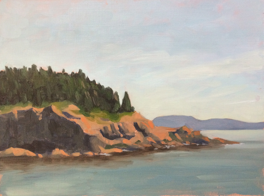
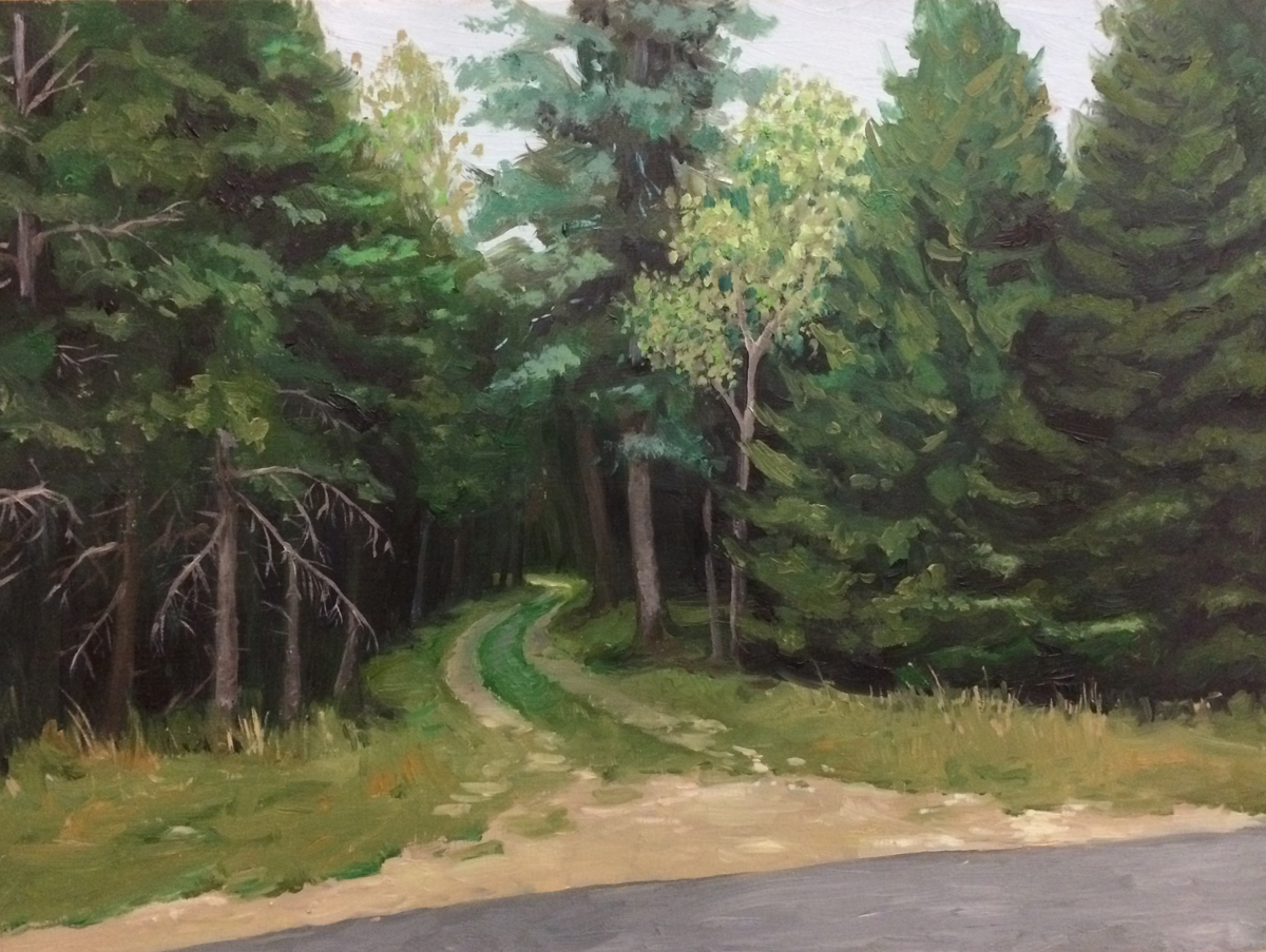
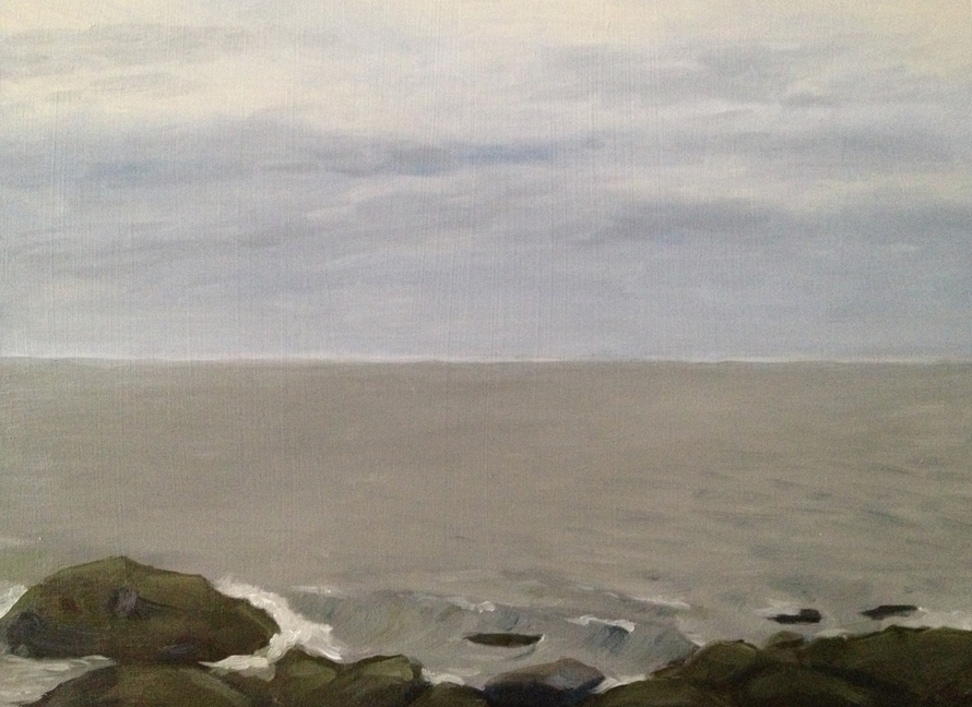
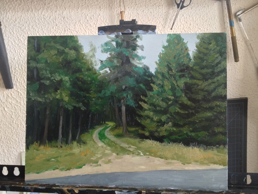
Untitled : Oil on board. 9″x12″ 2014
1. Seawall. (Tuesday morning) I was drawn to the scene by the interplay of the back lit rocks with the sparkling of the ocean. I also wanted to capture a sense of depth with the soft coloration of the peninsula in the background.
Good: First time painting out of the studio since 2013.
Bad: Well…everything.
- The coloration of the background has too much contrast to give a sense of depth
- the drawing is also a little off – the peninsula should be about 30% smaller and narrower
- the rocks could have used a steadier hand and better color temp. to really emphasize the crisp lighting
- …but by and large the worst bit for me is the ocean – it screams “amateur!” It’s too blue, too wavy, too muddy… I didn’t capture any of the crisp bands of color that I actually saw
- Lastly: I set this painting on the porch to dry and within an hour it was covered in little black bugs. I commandeered the closet shelves for the rest of the paintings to dry.

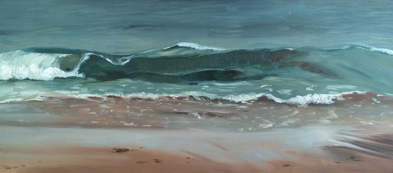
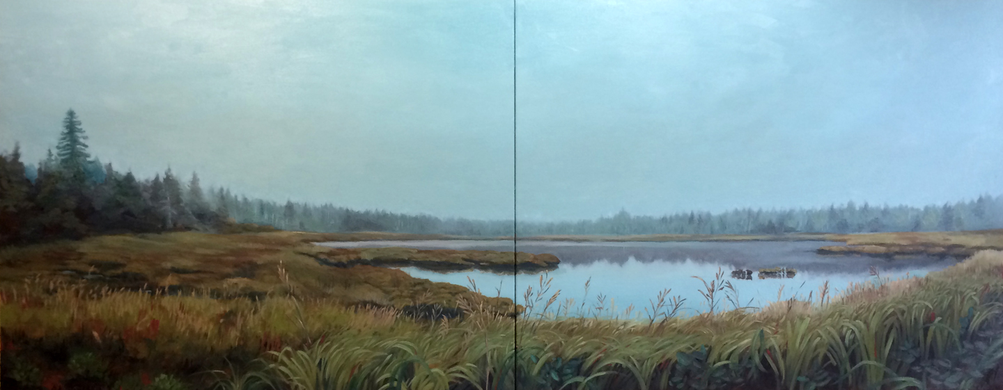
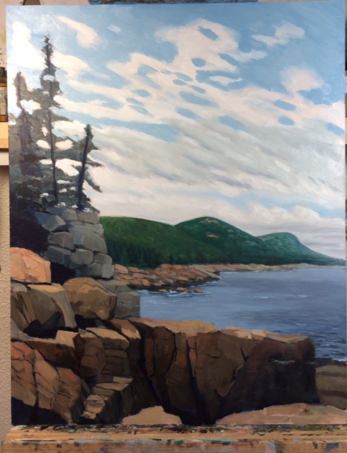
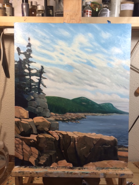
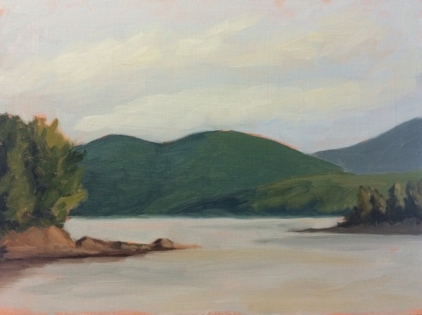
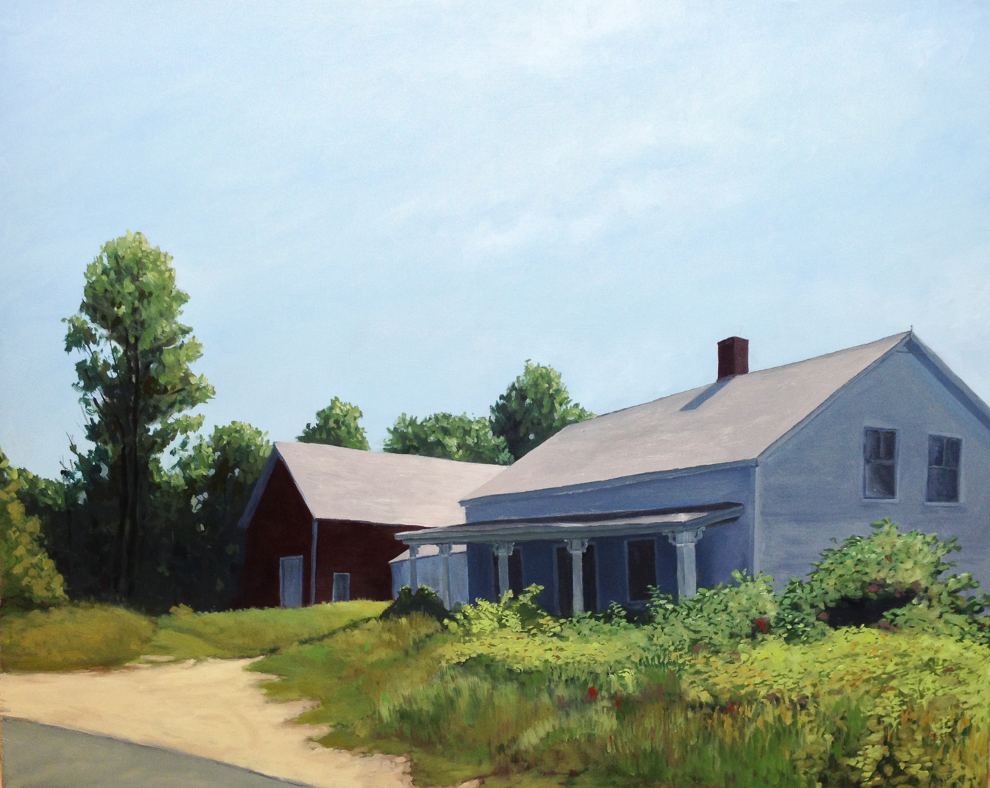
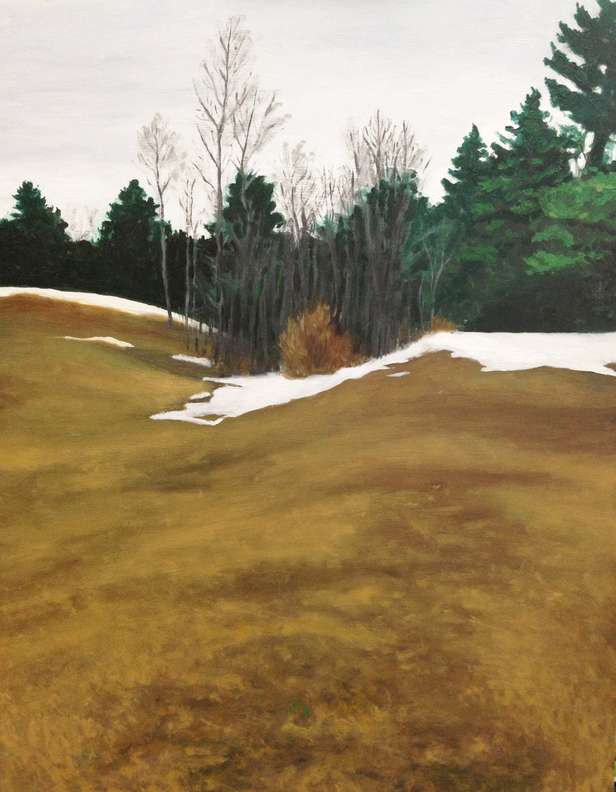
Untitled : Oil on board. 9″x12″ 2014
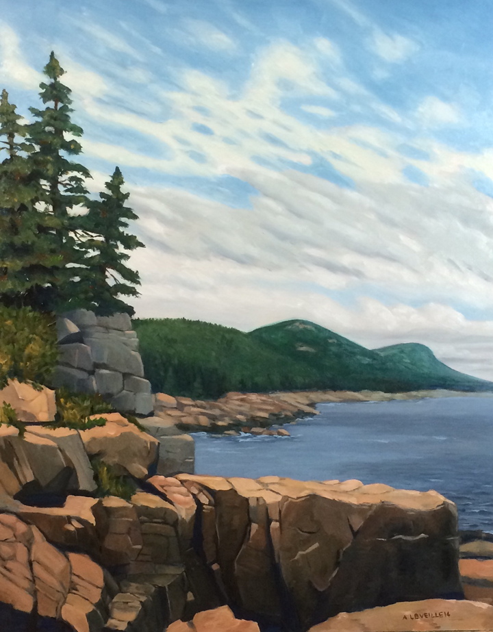
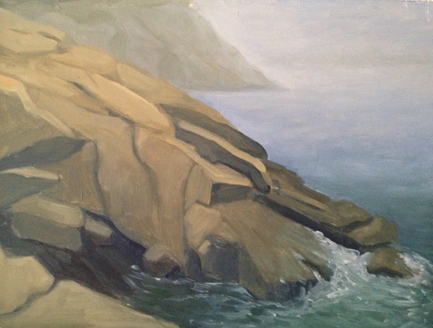
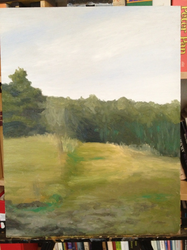
2. The Point. (Wednesday morning) The next day I decided to visit the ocean cliffs which had provided some good paintings last year. By and large I think this is the best painting of the trip.
Good:
- The drawing was concise;
- I spent time planning the color scheme and temperature
- the island in the background is the correct softness to emphasize depth;
- the ocean is banded in to color better.
Bad:
- The trees feel a little wonky and chunky along the top. I was using Viridian, which is quite transparent and so the whole mass of trees feels a bit unfinished, like an under-painting. I may touch these up once its dry in a few days.

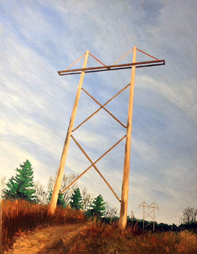
Untitled : Oil on board. 9″x12″ 2014
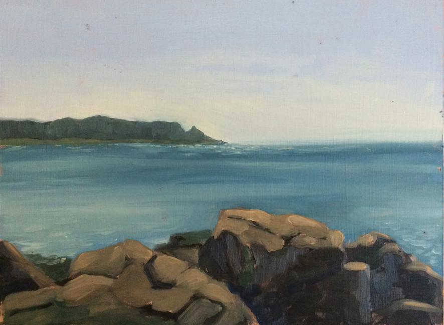
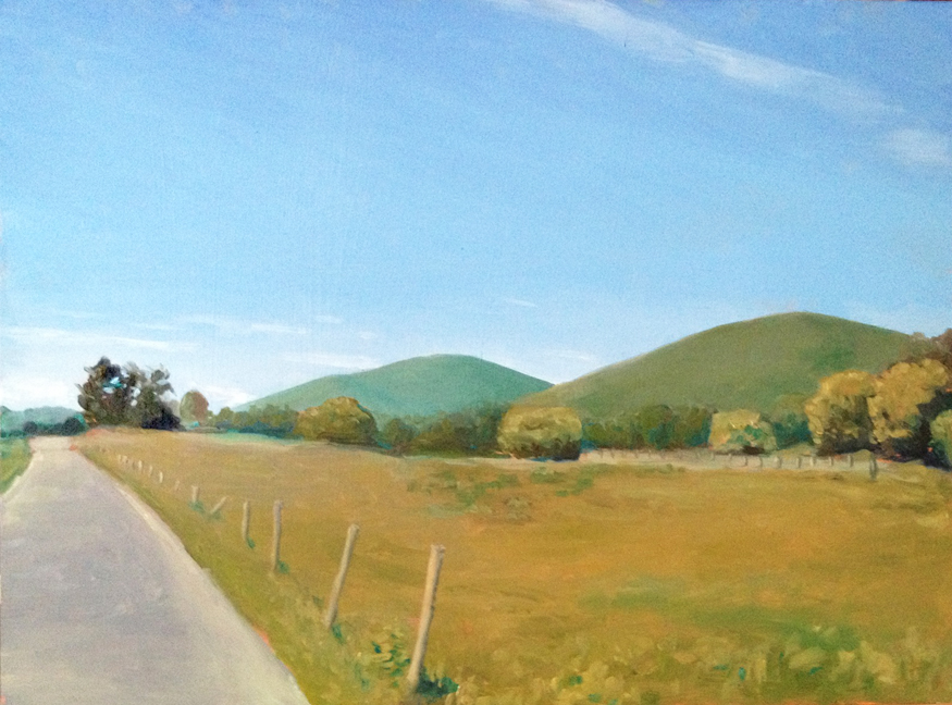
3. The Sound. (Wednesday evening) After the success of the last painting I was eager to go out again…but I wasn’t really sure where. I drove to a couple spots I thought might work, but each one was problematic – too public, the wrong lighting etc. The sun was on it’s way down and I was getting frustrated when I spotted a pull-off near a private beach.
Good:
- Quick! This painting was done in less than an hour, including set up and take-down.
- I carefully planned the progression of blue-greens to emphasize the depth of the mountains – they are still a bit too dark – but better than the cliff painting below.
- The color temperature is mostly correct
Bad:
- Composition. The piece feels kinda like a thrift-shop painting, with the two points of land jutting in from each side, and the dramatic hills in the back. I think adding one or two of the yachts that litter the sound would help bring a sense of scale and perspective
- The values are a bit off – especially in the trees nearest the foreground. They could be brightened up a little to emphasize the setting sun
- I’m like kinda maybe pretty sure I was trespassing

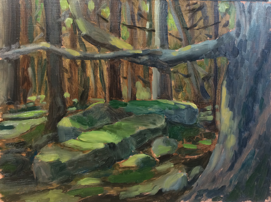
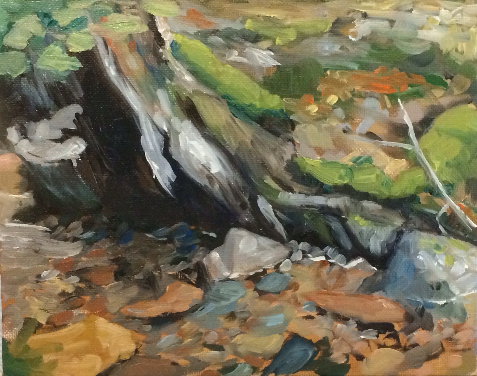
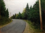
Untitled : Oil on board. 9″x12″ 2014
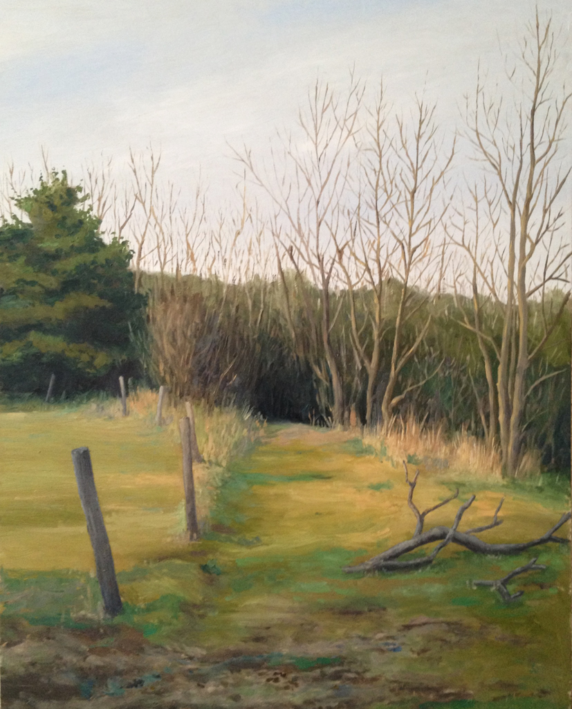
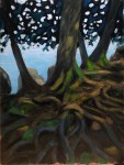
4. Trees. (Thursday morning) Lance suggested I take a break from the ocean painting to try something new. We spent an hour hiking the interior of the island looking for a spot to paint. I finally settled on this view with a pair of large rocks and a tree sitting just off the path.
Good:
- A new subject matter!
- Much of the light and shade values feel correct
- I saw a mink dart across the path while I was painting
Bad:
- I was set up in the bright sun looking into darker woods. The glare from the white palette screwed up my eyes. I should have picked a shadier spot
- The color temperature is wrong because of the sun – I couldn’t get an accurate gauge on how saturated the brown was, so the background doesn’t feel correct
- Ditto for some of the foreground rocks
- Changing light – this matters a LOT when the scene is dependent on sun dappling. In 30 minutes the light spots moved about 2 feet!

Untitled : Oil on board. 9″x12″ 2014
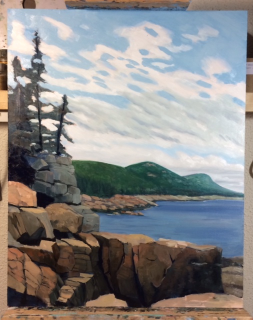
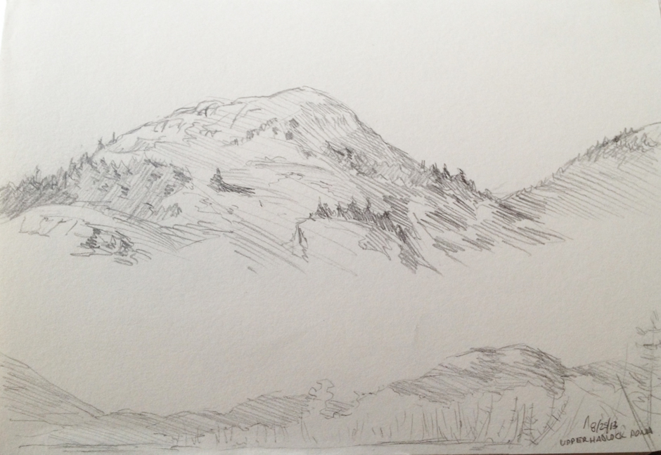
5. Cliffs. (Friday morning) I dragged Lance back to the ocean side on Friday to work on some more cliffs. I found an incredibly steep path that gave me a gorgeous view of the dramatic cliffs rising up from the ocean, with a backdrop of the Beehive and Gorham Mtns.
Good:
- An amazing view!
- I really enjoy painting cliffs
Bad:
- The drawing is wrong – from the scale of the background cliffs, to the shape and scale of the mountain, to the beach cliffs in the background
- Composition is wrong. I wanted to emphasize the vertical thrust of the cliffs… but I also wanted to have the dramatic mountains in the background. I should have focused on the former and turned the panel 90 degrees
- The cartoonish character of the mountains again conjures up thrift shop paintings. I realized that even though the mountains are dramatic I was over-scaling them.
- Again, using Viridian which left the mountains feeling unfinished and messy
- The sky was moody and half cloudy, half clear. I was running over time so I didn’t have a chance to work this out as carefully as I should have
- Color temp is way off and the whole thing is muddy. I was running low on turpentine and wasn’t as careful cleaning my brushes between areas. It shows

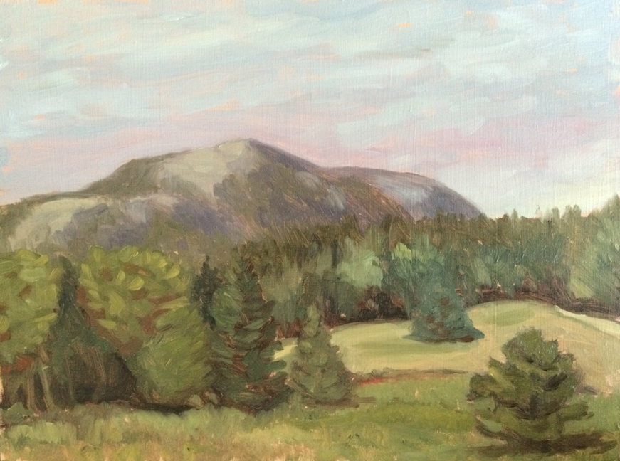
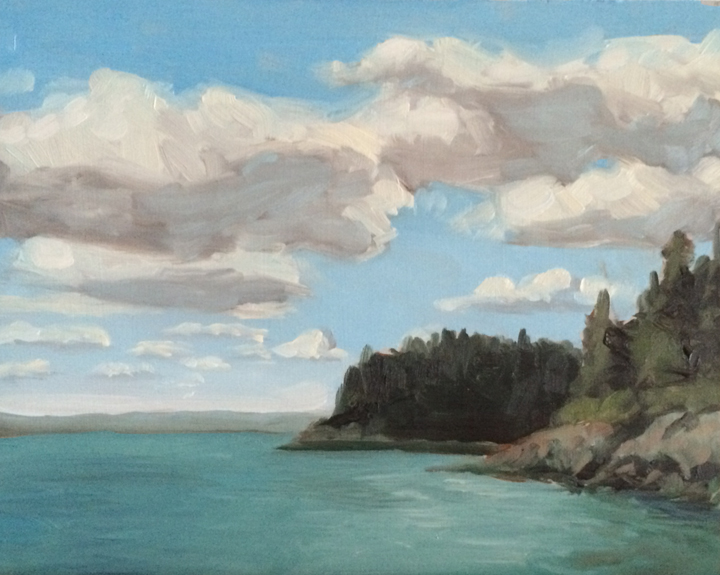
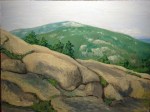
Untitled : Oil on board. 9″x12″ 2014
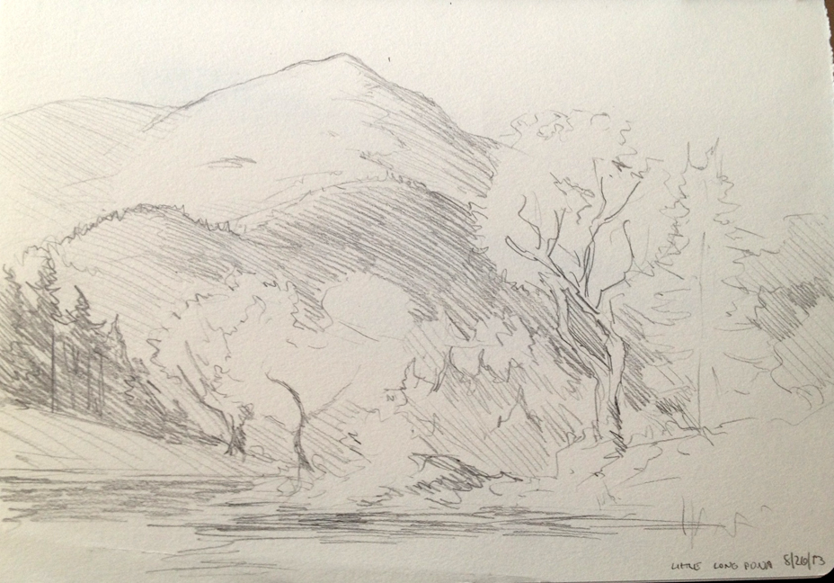
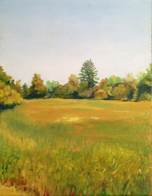
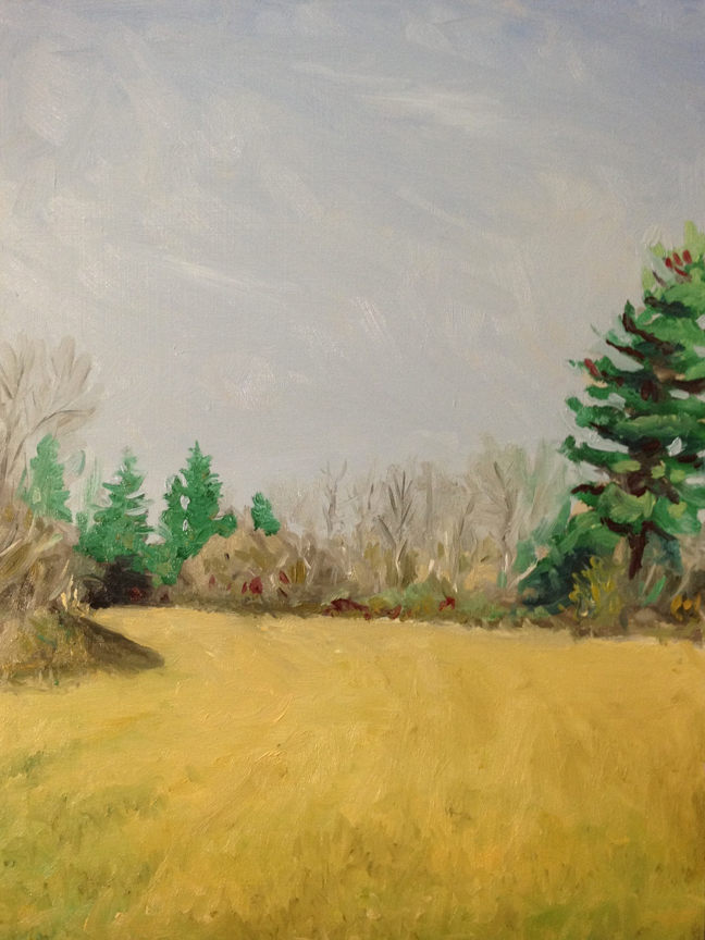
6. Little Long Pond. (Friday evening) I left Lance at the hotel Friday night and set out to find one last spot to paint. I stopped at one pond, but wasn’t moved, and so dashed over to Little Long Pond to catch the sunset on the meadow and Penobscot Mtn. The cloud cover killed any dramatic lighting and I was left with a peaceful, cool scene that (thankfully) stayed the same for an hour.
Good:
- I focused on the drawing and scale of the mountains. I’d realized that my brain wants to draw them much larger than they actually appear, which leads to that cartoonish quality.
- Better handling of color temperature…mostly
- Attention to composition – the focus for me was the dramatic rise of the mountain over the sweeping meadow
- Less focus on details, more on massing – which I think is what give the painting a better sense of depth
Bad:
- Mosquitoes – lots and lots of mosquitoes…Its difficult to focus and paint when you’re flailing your arms all over the place
- Greens.. are hard. Especially when you want to capture a yellowy green but in a cool light, so it doesn’t appear to sunny. Still working on this part. The large band of trees could have used a better contrast between the greens
- The large trees in the front right were one of the last bits to be painted. I was tired, and being eaten so I rushed through them. Better handling would have given a better sense of depth
Overall it was a great trip, and I think I’ve figured out much of what went wrong. The rest is just practice, practice, practice!!