Brickbottom Open Studios 2016

Brickbottom Open Studios are always interesting and fun!  Over 1000 people came through the building, according to our counters.  And, with over 100 artists between the Brickbottom complex and nearby Joy Street Studios there was a lot for those visitors to see.

A good chunk of those folks came through my studio – engaging in conversation, enjoying my work, and buying some too!  I sold over a dozen paintings overall.

I can’t express enough gratitude to everyone who came out to talk, look, and buy.  The investment in my passion gives me a boost (mentally and monetarily) to keep painting.  The conversations I have during these events also provides insight and fresh perspectives about my work.

Among those sold:

And special thanks to Lance, who puts up with 3 days of furniture moving, curtain hanging, labelling, and a steady flow of strangers marching through the house.


Catching up

Catching up on posting some work that’s been in the works.  The past few weeks have seen the completion of a new painting for Echoes, a commissioned painting for a wedding present, and scrambling to get everything organized for Brickbottom Open Studios!

Since I haven’t finished the commissioned landscape or photographed the Echoes painting, here are a few new pieces of candy:


Some weekend work

I haven’t posted in a couple weeks because I have been plodding through a larger piece. It’s coming along, slowly and with effort.  I’m at the point now where I wish it finished for the sake of it being finished;  I know if I set it aside and work on something else I will likely never return to it.

Also, in advance of open studios I have been ramping up my painting on days that I don’t work my full time job.  Normally, on a day off, I will putz around the house, and paint for 2-3 hours in the afternoon.  In the past two weeks, however, I have spent a total of 5 days off, painting for a 2-3 hour stretch in the morning, and another 2-3 hour stretch in the afternoon.  That’s a lot of standing in front of the easel!

But it pays off!  This week, in addition to the work on the larger painting, I completed two smaller works.  Thanks to the urging of friends, what started out as exercises have developed into small series.

Green and Orange and Green

Still playing with surface, reflections, throw-away-culture, and a limited palette.  These have moved somewhere past the exercise of the candy and beer cans and slightly into an idea.


Red, white, and light blue

Two paintings from the weekend exploring reflective surfaces again.  The PBR can was a lot of fun – the amount of detail work made it challenging in the best way.  The blue candy was for my friend Zachary, a photographer from NYC who is pushing me to keep going with the cans/candy.

The candy was done with 3 colors: Ult. Blue, Burnt Umber, and Cad Yellow (plus white). The can was done with the same, plus Cad Red Lt. I love working with a limited palette!

A new set up

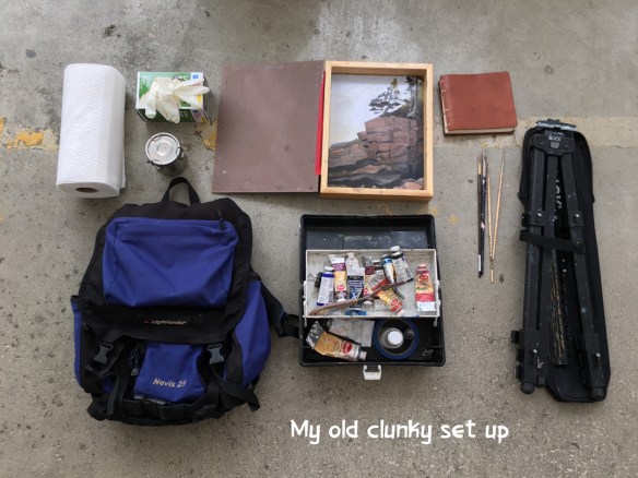
For several years now, my plein air set up has consisted of a lightweight aluminum easel, an art-bin with my paints in it, a modified picture frame for carrying wet panels, and various accessories – all stuffed into an old backpack.  It was heavy and cumbersome, and while it worked for some time, I decided it was time for an upgrade.

Old Set up

After some research I settled on Guerilla Painter‘s 9×12 Laptop box.  Guerilla offers a wide range of products and has an extensive number of add-on accessories, all consistently getting solid reviews.

There are plenty of junky mass-produced boxes, and a few high-end paint-box makers out there, notably Alla-Prima Pochade, which are gorgeous, but a little outside my price range for the limited amount of plein air painting that I do.  Guerilla fell right in the middle.

Guerilla accidentally sent me the 9×12″ Pochade box first, then sent my correct order.  I had time with both boxes to compare, and I’m convinced I made the right choice in the Laptop.  My review of both is below.


1) Size.  Plein air painting is about being portable. The Pochade is almost 6″ deep including the feet. Both are meant to hold 9″x12″ panels and possibly smaller/larger with add-ons and modifications.  When open the Pochade has an awkward lip jutting up 2″ from the palette. This was one of the biggest turn-offs for me as I can imagine it getting in the way of my knife and brushes.

The Laptop is considerably shorter, clocking in at 3″, which means less storage, but also less weight and less bulk. The palette is almost flush with the edges and there is a much shorter lip on the front.

2) Construction.  Both boxes are solid, but have way too many screws.  I’m not sure why, as gluing the panels together would give sufficient strength. They probably won’t add much weight, but they clutter an otherwise streamlined look.   The Pochade has a beefy aluminum armature to control tilt.  The Laptop armature is smaller and doesn’t have as many washers, which makes me wonder if it will slip with repeated use. Time will tell.

3) Tripod mount. Both boxes come with a built in tripod mount.  The Pochade has a deeper rubber foot, keeping the tripod mount from touching a table surface.  It also has a leather handle.  The Laptop has shallower feet, which means you need to either remove the tripod plate each time you use the Laptop on a table, or add deeper feet. I’m planning on that, plus adding my own handle.

On the Pochade the mount is centered, but on the laptop it is set on the back edge. (see below about tripods)

4) Internal storage. With the additional depth the Pochade offers almost double the storage. This might be good if you want a whole studio-in-a-box, but my kit has always been as lean as possible. Even without modification, the Laptop can easily hold 10 tubes of paint, several brushes, palette knife, medium, turps, brush cleaner, palette cups etc, and still allow the palette to slide into place. Once my brush handles are trimmed down and a divider put in I will have room for another 8-10 tubes of paint.

Guerilla Painter claims the Laptop can fit 4 wet panels.  I’m not sure how this is possible.  It appears you can get one backed against the lid, two back to back in the clips – but that is only 3 paintings, and I struggled to get a panel cleanly against the lid. It seems the clip is set too far back, causing it to scrape against the edge of the panel.  The lack of storage won’t bother me – it’s rare that I do even two paintings in a day.  But still, Guerilla should either clarify or update.

The Pochade has much larger clips that allow for multiple panels, or even a thin stretched canvas. It also has grooves in the storage box for additional dividers and what appears to be a shelf.  The Laptop has a single groove, but I plan on adding my own divider later.

Both boxes are set up to paint 9×12 in a landscape format.  I’m sure a little modification could easily fix that.  Stay tuned.

5) Tripods.  The trend in pochade boxes is to include an integrated tripod mount. This allows you to screw in a quick-release plate that comes with most camera tripods.  But a pochade box is not a camera.  It is bigger, and usually heavier, and has physical stress being applied (pushing brushes against your palette and your panel).  I purchased a $19 Amazon basics tripod that would work just fine with a standard camera.  However, the quick-release plate was plastic, and the receiving port was also plastic, which meant a LOT of flex and bounce on the Laptop, and almost complete instability on the heavier Pochade box.

I did more research and purchased a $100 Neewer carbon fiber tripod. Everything is sturdier than the cheaper tripod – the legs had less flex, the clips tightened securely, and the quick release mounting plate and port were both cast aluminum: no flex at all when mounted to the box. Neewer also makes some aluminum versions in the $60-$80 range.  They all appear to come with metal-on-metal quick release plates for a rock solid mount. Do yourself a favor and splurge on a good tripod with a metal on metal mounting plate.

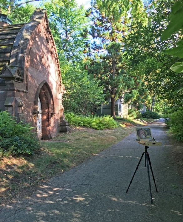
Cabot Lodge

The new set up in action at Mt Auburn Cemetery.


Shiny Shiny

This month I spent a week in Maine painting landscapes (images coming soon!).  The experience once again drove home how challenging landscape painting is for me: from siting locations, to handling trees, to edge control, to atmospheric perspective.

So as a treat to myself when I returned home I spent this weekend doing studies of hard-edged, candy-colored, shiny things.

The cans were painted in 3 and 4 colors with a large brush – again, pushing myself away from the detail work I normally do. The red candy was 3 colors, but I did allow myself to use a small brush.

A study and some exercise.

It’s been a couple weeks since my last post – not because I wasn’t painting, but because the painting wasn’t done. I’m planning another larger scale landscape painting and I spent a week working on a smaller study. It was helpful in assessing the areas that will be challenging on the larger scale: keeping the ground transparent and textured, being aware of temperature relationships, and figuring out how to paint a goddam tree without leaves on it.

I’ve also been ramping up my landscape painting in general because I go on vacation NEXT WEEK!  We’ll be back up in Acadia park and I will be scrambling over hill and dale trying to find a place to paint.  Every year past has followed a similar routine: the first day out painting is like learning to ride a bike all over again -usually resulting in a wasted day/painting.

This week I did a one-half-plein-air painting of the billboard next to my house through an open window.  And yesterday I put on my go pack and biked out to the Charles River to complete a mediocre painting.  Just as predicted above it was a bit of starting from scratch.  Hopefully that will all be gone by the time I get to Maine.

Silver

Another week, another beer can study.  I returned to small brushes and returned to my normal style after last week’s experiment.  Next week I may take the experiment in the opposite direction and do a layered/glazed painting of a can.  The printed aluminum is an ideal candidate for glazing and getting really deep, rich colors.

Big brush

I challenged myself to do this painting using a 3/4″ filbert brush instead of the 1/2″ and 1/4″ flats I normally use.  The flat brushes let me paint crisp edges and thin lines.  The filbert was an exercise in letting go and loosening up.  I also added a couple extra cans to push me for speed.

Corona

Another shiny beer can.  I think I’m going to attempt a different sort of back drop next time.  For the past several paintings I have spent an hour or two on the main subject, then mixed a greyish white with a bunch of medium to quickly paint in the background.  It leaves the objects hovering in some weird non-space.  I like that at some points, but I think it may also feel a bit formulaic.

Cons: the shadows on the white can were hard to get the color temp just right.

Pros: It was surprisingly fun to paint the calligraphy upside down.

Cherries, take two.

Tried again with Alizarin and once again it was challenging.  I was also cranky and tired from a long walk in the sun, which resulted in the first attempt at this painting being wiped away.  I went back at it after a little nap and felt much better about the painting.

I used natural light this time, which gives much softer shadows than the bright overheads.

Cherries

Once again I’m reminded that Alizarin Crimson is a cruel lover when painting directly.  I was able to overcome the transparency of the pigment, but the lower reflected lights came out a little hot-pink and a little to bright in value. Welp… I have half a bag of cherries left so we’ll see what happens next time.

Tree. House.

This weekend was a bit weird and emotional losing Rocket.  However, there were some bright spots:  On Friday evening I sold the large of waves paintings to a gentleman who saw my work at Open Studios.  I also handed off An Old House to it’s new owner.

And I wrapped up a new painting on Saturday, and did a little sketch on Sunday. The red house painting is finished – I think.  I wonder if it needs more detail.  I’ll have to revisit it in a week or two to see if I feel the same then.

Rocket.

19 years ago Paul and I rescued a tiny kitten from the MSPCA.  I liked his weird blue fur.  For three weeks he didn’t have a name, until his habit of endlessly sprinting the length of the hallway prompted us to call him Rocket.

He ruined shoes.  He stole food off the counter.  He obsessively hunted q-tips.  His demeanor alternated between quietly regal and goofball spastic.  His favorite perch was either draped across your shoulders, or in the middle of whatever you happened to be working on.  Relentlessly mischievous, Rocket was never malicious, except the time we brought home another kitten to keep him company.  Then he shat in the center of our bed.

After Paul and I moved apart I didn’t see Rocket as much as I would have liked.  But any time I did visit I was greeted like an old friend.  Yesterday Paul called to tell me that Rocket did not have much time left.  Kidney problems and old age made him frail, sometimes confused by his surroundings, and in pain. I was able to visit one last time and sit quietly on the porch as he leaned against my leg, trying to appear aloof, but gently nudging my hand when I stopped petting him.

Today there is a little furry blue-gray hole in the world.


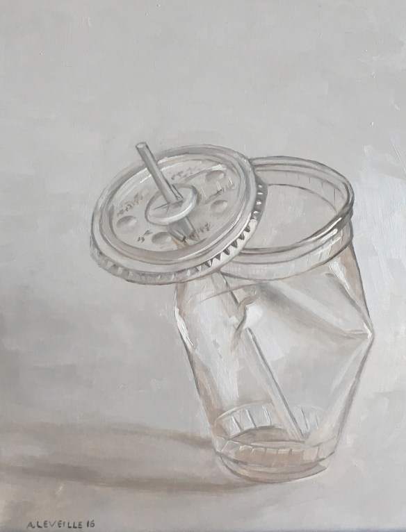
Plastic Cup

This is something new.  Partially inspired by the cans and candy paintings, but also more of an idea forming in the background.  This particular study was extremely challenging, and is not exactly what I was going for, but is headed in the right direction.  Perhaps there will be more.

Plastic Cup 1

untitled (plastic cup) : Oil on Board. 14″x18″  2016

Feeling blue…


A set of studies from this past week/weekend.  I find myself drawn to the reflective and hyper-saturated colors of manmade objects more and more. They are a completely different challenge than landscapes: hard vs soft, defined edges vs atmosphere, saturated colors vs a millions shades of neutral.


All of the donuts!

Still continuing the sweets theme this week.  A couple more donuts added to the collection.  I’m happier about the surface of these two: the jelly had to be wiped off and repainted at one point to better understand the sugary texture on top.

However, both suffer a bit in the shadow area in the bite.  I’m not sure exactly what to mix to convey shadows that are both cool, deep, and yellow… every time I mixed up the colors I came out with something of a grey green approximation.  Maybe the next study will be a focus on just that part.

Enjoy.

Time to Paint the Donuts…

The flexibility of painting small allows for a variety of subject matter without a huge investment of time.  Last week someone at work brought donuts… this weekend I decided to paint some.

The first painting I did was the chocolate glazed, and it clearly is the best.  I was distracted and running late while painting the pink donut, so it had to be partially wiped off and re-painted later.  And the plain glazed was painted under a rapidly changing light, which was also distracting.

These were a fun group. For each one painted I bought an additional 2-3 ‘models’ which Lance and I promptly ate… I might be done with donuts for a while.

From There to Here

One of my interests outside of art-making is modern design.  I’ve studied and collected modernism for a number of years.  This February I was honored and excited to have my essay chosen by the Eames Office and the Barbican Centre as the winning entry in their “Your Eames Story” contest.

The essay below describes my introduction to, and subsequent obsession with, modern design through the work of Charles and Ray Eames.

FROM THERE TO HERE

Sometime in the mid 1980s, my father was perusing the offerings of the swap-shack, a common feature at rural garbage dumps in which folks leave usable goods for others to take. Our family was pragmatic and not wealthy, and we had acquired any number of practical items from the swap-shack: Ice skates for me and my siblings, blenders, picture frames, farm equipment, etc. On this day, my father brought home two treasures. One was a life sized Halloween decoration—a ceramic bust of a witch, complete with a built in light bulb to illuminate her clear glass eyes. Your Eames Story Winner_Barbian Center_Adam Leveille_DCW_FBThe other my father later described as “the ugliest chair (he) had ever seen.” Naturally, he had to have it.

Both items ended up unceremoniously tossed into the upper hayloft of our barn, a catchall place that was the backdrop to my childhood adventures. Through the years, the black plywood chair sat quietly in the background, tucked between the wall and a dusty stack of old window screens. The witch’s head received far more attention and play, eventually suffering a spectacular fall (or was she pushed?) that shattered her into a million pieces.

In the early 2000s, I returned home from college to store some belongings in the barn. As I tucked my mountain bike against the wall of the loft, I moved aside the black plywood chair and was struck by its form. What was it that I was seeing? It was a shape that was almost familiar, but that I couldn’t quite place.

When I returned to Boston, I typed “plywood chair” into a search engine, and there was the very same piece from my father’s barn. Or was it? There seemed to be two models of this particular chair: A lounge chair and a dining chair. I was uncertain which one I had encountered, so I began reading. Through various websites, blogs, and forums, I discovered the chair in my father’s barn was an Eames DCW (Dining Chair Wood). It was a design icon. And just like my father, I had to have it.

The next time I spoke to my father was Thanksgiving, and when he asked what I wanted for Christmas I mentioned, as casually as I could, the chair in the loft.

Christmas arrived. There was no chair. My father seemed surprised when I asked about it. “Oh that?” he said, “You can just take that… I didn’t think you were serious.”

I hesitate to use the word fate, although I can’t think of another way an Eames chair would end up at a garbage dump in a rural New Hampshire. My town, with a population of less than 5,000, was not exactly a hotbed of modernism. But the chair was there, and though dented, chipped, and paint splattered, having clearly lived a long life, it sparked a design obsession.

I devoured everything I could about the Eameses, and through them was introduced to the other great designers of modernism. Countless hours were spent combing Craigslist and eBay for vintage pieces. I went on shopping sprees, voraciously collecting dozens and dozens of chairs—not just to own and use, but from which to learn. I observed and catalogued the minutia of glides, shock-mounts, chair bases, and wood varieties; each new chair brought fresh insights and understanding of the design process and how profoundly small changes affected the interaction of the user and the object.

Seeing and touching the pieces taught me things I could never have learned otherwise. My collecting also earned me some strained relationships. Late one Saturday night, I pleaded with a friend to borrow his car—and his ATM card—to pick up a set of vintage plywood chairs. Thankfully, he obliged. A pair of roommates were less understanding, and they politely asked me to move out after I had acquired upwards of 50 chairs in the course of two years.

But, eventually, my obsession became a focus, and then a career. In 2006, I began working at that glittering temple of modernism: Design Within Reach. I slowly whittled down my collection of chairs to those I used every day. I expanded my knowledge about other designers of the modernist movement. My enthusiasm was channeled into teaching clients about the nature and flexibility of modernism. The recession of 2008 sharply brought into focus the need for practical, timeless designs, and naturally the work of Charles and Ray Eames rose to the forefront.

My obsession also moved beyond furniture and became a way of living. I learned from the Eameses that the world is never perfect, but is always improvable. They taught me that work should be playful and that play should be taken seriously, no matter the application. Their process contains a brightness and optimism that can just as easily be applied to social justice or environmental sustainability as it can be to chairs and tables. It is seeing hope emerge through the clouds of fear and war, as relevant now as in the 1950s.

I still work for Design Within Reach, having managed the Cambridge studio since 2009. My enthusiasm for modernism has not waned. Each day I work among some of the most beautiful designs in history. I get to share my passion and enthusiasm with my coworkers, and help educate my clients. For the Eameses and their little plywood chair—and for my father—I am ever grateful.

Adam Leveille

You can visit the Eames Office here:

http://www.eamesoffice.com/your-eames-story/from-there-to-here/

and the Barbican Centre Blog here:

http://blog.barbican.org.uk/2016/02/your-eames-story/


So sweet it makes my mouth water.

I started this series as an exercise using a couple of pieces of candy from works by Felix Gonzales-Torres.  They are oil on 6×8″ wood panels.   My friend Zachary urged me to push the idea a little further, so I perused the candy aisle of the grocery store, bought a few models, painted the ones I liked, and ate those I didn’t.

The allure/challenge with these pieces was reflections and transparencies, and the rich colors.  Reflective surfaces are difficult to map out and depend a great deal on subtleties of value.  However, when done correctly, I find them rewarding.

I also enjoyed that I didn’t have to think much about the idea.  I had a pile of candies to choose from, and a pile of painting surfaces ready to go.  But the danger I see in pushing this series much further is falling it a groove of formulaic repetition.

The sweet-hearts was a one-off done on Valentine’s day.


Candy and Flowers

And it’s not even Valentine’s Day.  Three paintings from the weekend.  The models for the two candies are from Felix Gonzalles-Torres’ artworks, in which viewers are invited to take away candies from large piles.

Landscape, Nude, Still Life

Did three more small paintings over the weekend.  The nude was the most difficult again.  If you ignore the weird face and the misshapen hand on the right I’m happy with it.

The landscape was fine, just an exercise to jump start me painting.

The still life was done fast and poorly and was so offensively uninteresting that I wiped it off as soon as it was done.

Small Works over the Weekend

Ive decided to keep up the small painting projects.  I find them helpful in learning about color, composition, and value.  Also they aren’t quite as intimidating as a 4 foot expanse of canvas.

This weekend I did a flurry of paintings over 4 days.  I started with looking out the window at the view of east Cambridge.  The lower half of the painting is somewhat lost, but I’m happy with the courthouse tower and the trees around the tall building.

The second painting was from a photo of Maine.  I am both pleased and annoyed with this painting.  While the underlying structure came out correct, I was in a hurry when I painting the light plane of the tree trunk in and it feels generic.

On a snowy Saturday I tried out a portrait experiment, once again working from a photo.  While the resemblance from the model is definitely off, I like the looseness of it.  When I paint I tend towards tight control of detail, so relaxing a bit was both exciting and frustrating.

I followed up the portrait with a botched figure study that was so bad I’m not even including it.  However, Sunday night I came back to the easel to try again and am somewhat satisfied.  As I said to Lance: Once I figure out color mixing, values, and anatomy, I might be a decent painter. 😉

Making Waves

Fresh into the new year and I have completed – I think- another painting.  This one was difficult, sitting on the easel for about 2 months before getting to this point.  Of course things like Christmas and New Years got in the way, but this was also one of the first times I’ve really wanted to just abandon a piece and start over.

But I plowed through it and am somewhat satisfied with the results.

A part of the large landscapes series, this piece is sort of about a sense of inevitability. I tried to capture the aspects of the wave building, cresting, and crashing back down.  I also painted the sky moody to keep the piece from looking like a vacation photo.