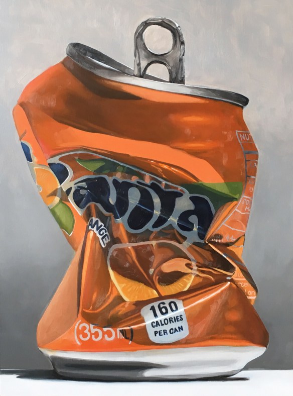
Surface #1

I’ve been steadily plugging along at the large scale paintings.  Somerville Open Studios is about a month away and I want to have a cohesive body of work showing.

The first of the big candy paintings is done.  I’m happy with the piece and learned a lot in the process.  Just like the cans, everything gets a little more challenging when it is scaled up.  I’ve been using more glazing techniques and multiple layers to get the reflective and color qualities that I want.


Dreams #2

A few more weeks of work and I have finished Dreams #2, the second of the large scale can paintings.  Damn they are challenging!  In smaller paintings there is the ability for much more gestural and abstraction, but on a larger scale all that needs to be refined much more. Particularly of issue on this painting was the fine print near the recycle logo. I chose to move towards abstraction rather than pushing in the direction of photo-realism.  It is very important to me that these remain paintings, not a slavish photographic representation.

Dreams #1

After a couple dozen studies of soda and beer cans I launched into a large scale painting.  It took several weeks to finish.  As I’ve mentioned in the past, scaling up paintings exponentially increases the working time.

The idea for the series has slowly come together. At first the cans were an exercise in color mixing and painting reflective surfaces, but as I worked on them I saw a deeper meaning.

dreams-1

Dreams No.1 : Oil on wood panel. 18″x 24″  2017

Catching up

Catching up on posting some work that’s been in the works.  The past few weeks have seen the completion of a new painting for Echoes, a commissioned painting for a wedding present, and scrambling to get everything organized for Brickbottom Open Studios!

Since I haven’t finished the commissioned landscape or photographed the Echoes painting, here are a few new pieces of candy:


Some weekend work

I haven’t posted in a couple weeks because I have been plodding through a larger piece. It’s coming along, slowly and with effort.  I’m at the point now where I wish it finished for the sake of it being finished;  I know if I set it aside and work on something else I will likely never return to it.

Also, in advance of open studios I have been ramping up my painting on days that I don’t work my full time job.  Normally, on a day off, I will putz around the house, and paint for 2-3 hours in the afternoon.  In the past two weeks, however, I have spent a total of 5 days off, painting for a 2-3 hour stretch in the morning, and another 2-3 hour stretch in the afternoon.  That’s a lot of standing in front of the easel!

But it pays off!  This week, in addition to the work on the larger painting, I completed two smaller works.  Thanks to the urging of friends, what started out as exercises have developed into small series.

Green and Orange and Green

Still playing with surface, reflections, throw-away-culture, and a limited palette.  These have moved somewhere past the exercise of the candy and beer cans and slightly into an idea.


Red, white, and light blue

Two paintings from the weekend exploring reflective surfaces again.  The PBR can was a lot of fun – the amount of detail work made it challenging in the best way.  The blue candy was for my friend Zachary, a photographer from NYC who is pushing me to keep going with the cans/candy.

The candy was done with 3 colors: Ult. Blue, Burnt Umber, and Cad Yellow (plus white). The can was done with the same, plus Cad Red Lt. I love working with a limited palette!

Shiny Shiny

This month I spent a week in Maine painting landscapes (images coming soon!).  The experience once again drove home how challenging landscape painting is for me: from siting locations, to handling trees, to edge control, to atmospheric perspective.

So as a treat to myself when I returned home I spent this weekend doing studies of hard-edged, candy-colored, shiny things.

The cans were painted in 3 and 4 colors with a large brush – again, pushing myself away from the detail work I normally do. The red candy was 3 colors, but I did allow myself to use a small brush.

Big brush

I challenged myself to do this painting using a 3/4″ filbert brush instead of the 1/2″ and 1/4″ flats I normally use.  The flat brushes let me paint crisp edges and thin lines.  The filbert was an exercise in letting go and loosening up.  I also added a couple extra cans to push me for speed.

Corona

Another shiny beer can.  I think I’m going to attempt a different sort of back drop next time.  For the past several paintings I have spent an hour or two on the main subject, then mixed a greyish white with a bunch of medium to quickly paint in the background.  It leaves the objects hovering in some weird non-space.  I like that at some points, but I think it may also feel a bit formulaic.

Cons: the shadows on the white can were hard to get the color temp just right.

Pros: It was surprisingly fun to paint the calligraphy upside down.

Feeling blue…


A set of studies from this past week/weekend.  I find myself drawn to the reflective and hyper-saturated colors of manmade objects more and more. They are a completely different challenge than landscapes: hard vs soft, defined edges vs atmosphere, saturated colors vs a millions shades of neutral.