Landscape, Nude, Still Life

Did three more small paintings over the weekend.  The nude was the most difficult again.  If you ignore the weird face and the misshapen hand on the right I’m happy with it.

The landscape was fine, just an exercise to jump start me painting.

The still life was done fast and poorly and was so offensively uninteresting that I wiped it off as soon as it was done.

Painting in the wilds of Maine

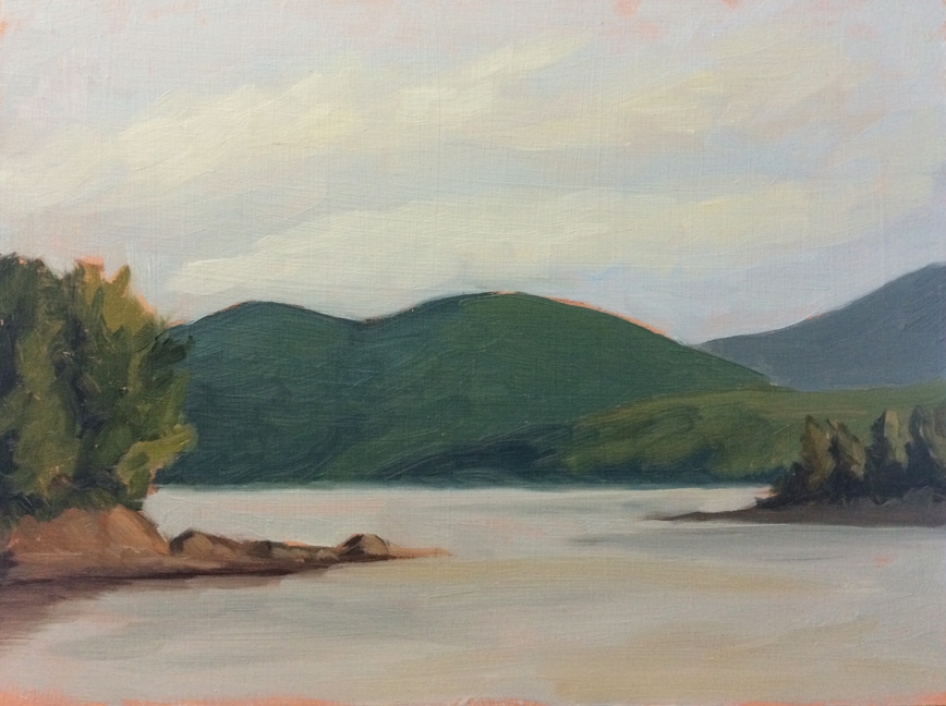
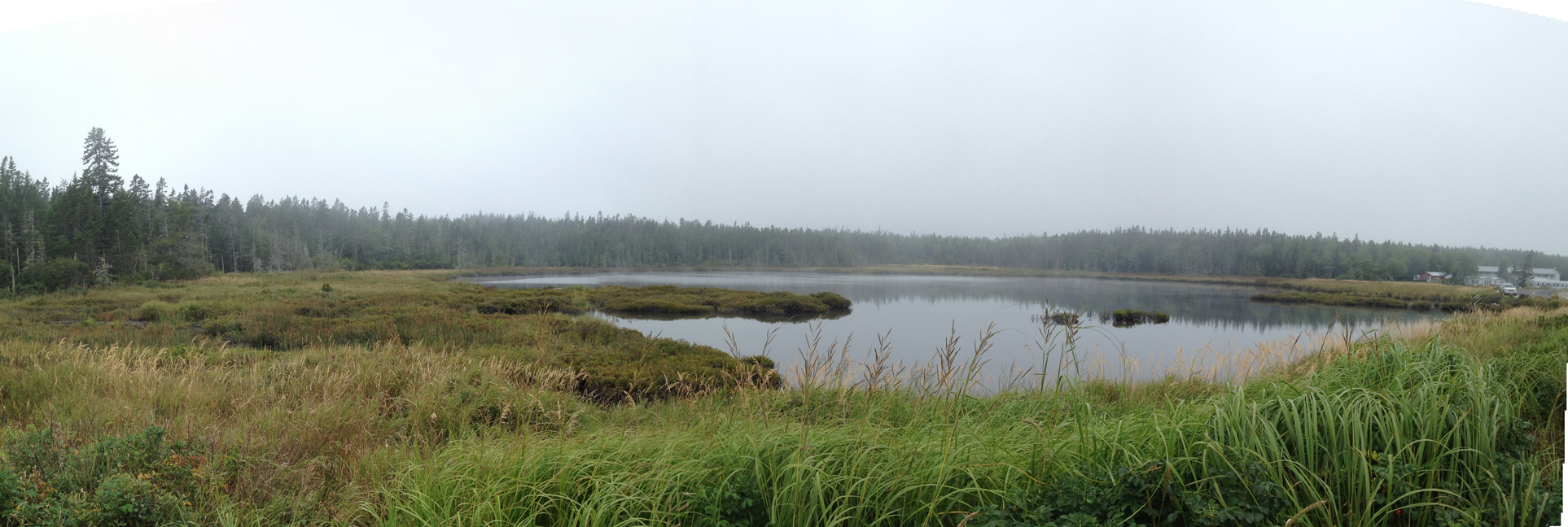
Its August, which means another trip up to one of my favorite places: Acadia National Park.  If you’ve never been Acadia is this weird mixture of almost primeval landscapes, early 20th century industry, and New England charm.

We stayed on the quiet side of the island, and I did 5 paintings in 6 days.  The weather was a bit uncooperative but that’s how it goes with painting in the wild.
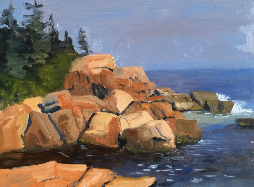
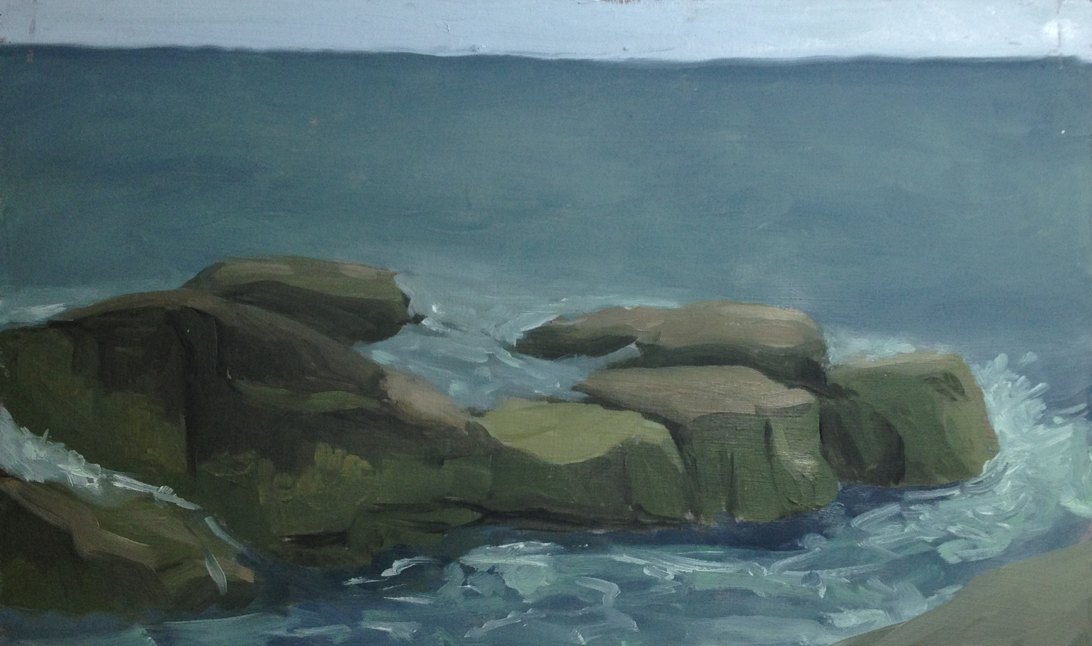
First Day : Blah.

untitled : Oil on board. 9"x12"  2015

untitled : Oil on board. 9″x12″ 2015

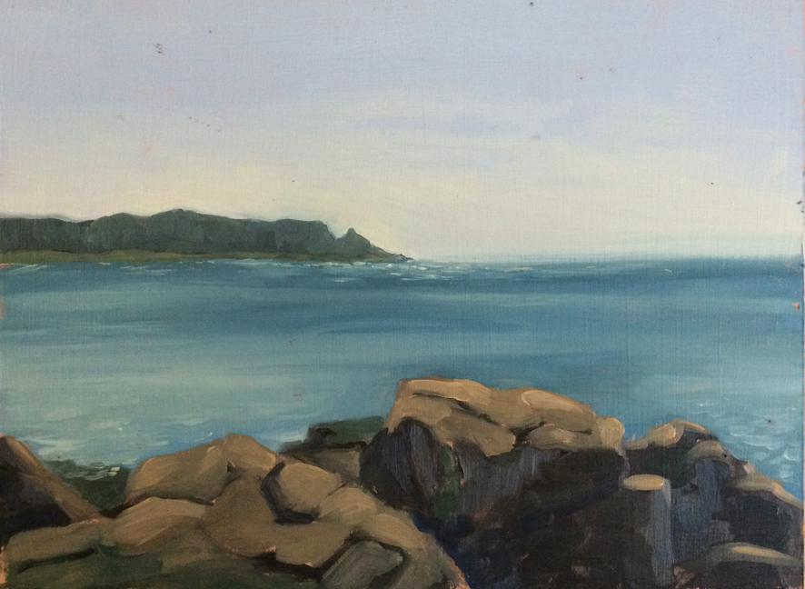
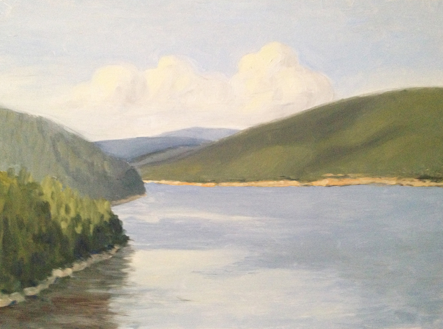
One of the biggest pressures I find is choosing a spot to paint.  I’m so seduced by the beautiful views that I want to paint them all, but that risks being repetitive.  I stopped at a dozen places before settling on this one.  The day was muggy and hot with a blazing sun, no shade, and no sunscreen.  I was rushing and things fell apart pretty quickly. I’m happy with the blues and browns in the water, and the olive green rocks to the edge.  Everything else is a mess. Unless I was emulating Marsden Hartley, in which case it’s great.

Second Day : Blah-er.

untitled : Oil on board. 9"x12"  2015

untitled : Oil on board. 9″x12″ 2015

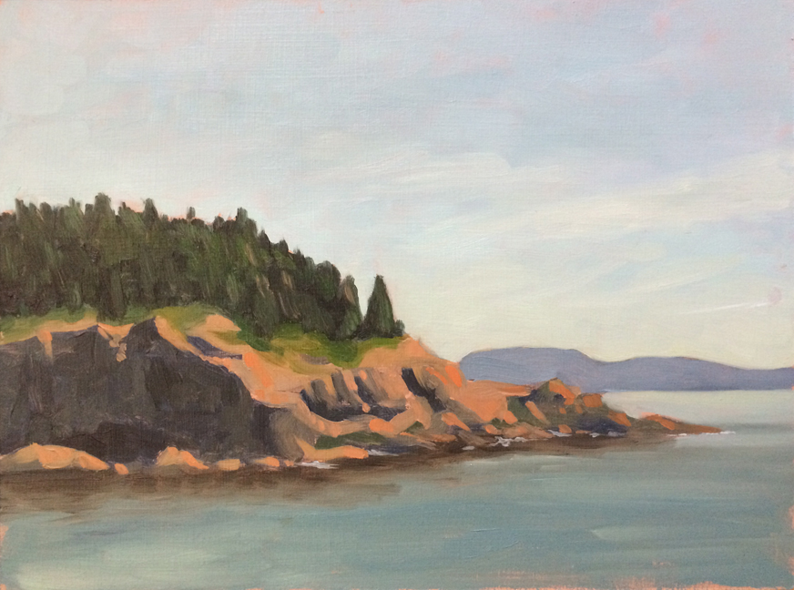
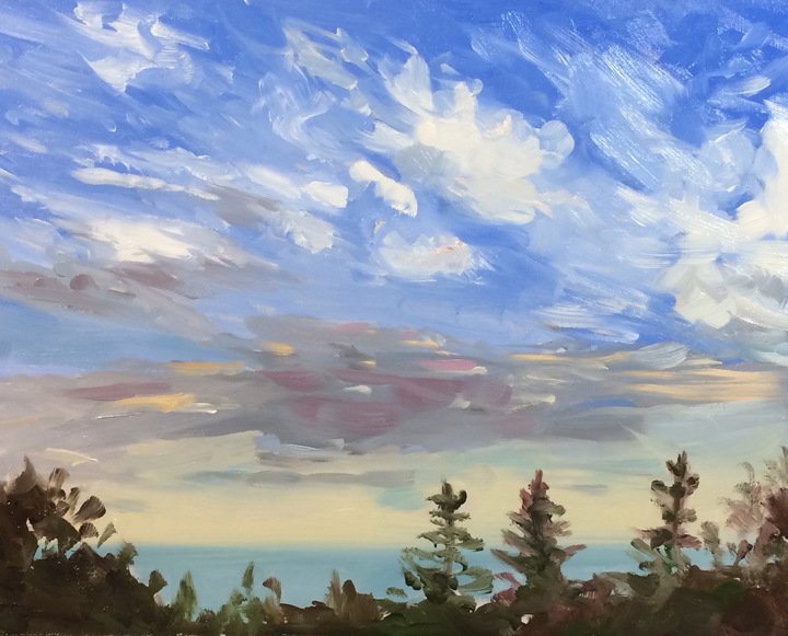
The fog in Acadia is almost a living entity.  On Wednesday it rolled in and didn’t leave until Saturday.  This was off a little hike and while there are some areas that I really like – the almost impressionistic trees – the foreground is really bland.  I had meant to leave room to add in some dark pine boughs to frame the piece, which may help.

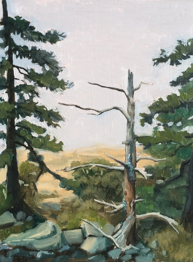
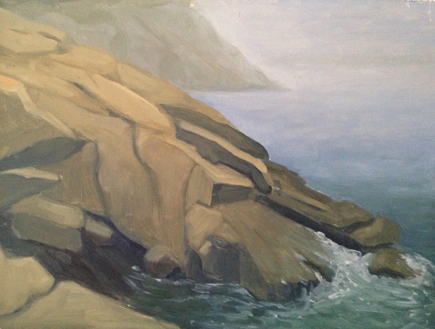
Third Day : More Fog.

untitled : Oil on board. 9"x12"  2015

untitled : Oil on board. 9″x12″ 2015

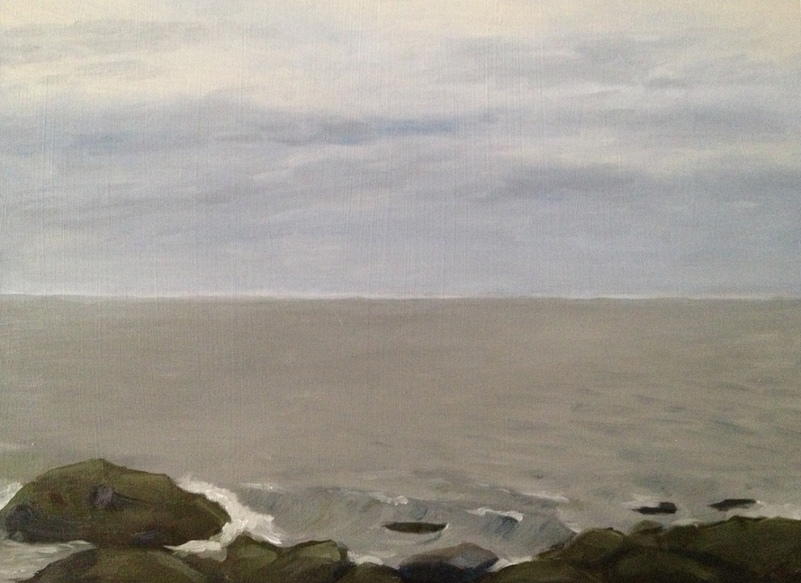
I dragged Lance along on another short hike out to the coast.  He set up a chair and read a book, I painted the only thing I could see through the fog – this stark dead tree.  I started thinking in terms of color temperature and I think it helped, although not much could save those poor plastic rocks in the bottom.

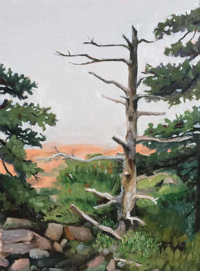
Fourth Day: More Tree

untitled : Oil on board. 9"x12"  2015

untitled : Oil on board. 9″x12″ 2015

After I paint I often find myself staring at the painting or a photo of it and wondering what I could have done better.  In the case of the tree I was really unsatisfied with the rocks, and I felt the branches in the earlier painting didn’t convey the shadows properly.  I also thought the tree to the right side had gotten muddled and lost.

So I went back again and set up in the same spot.  I trimmed the composition a little closer and tried to be as careful and deliberate as I could.  It’s a much better attempt, but those goddam rocks still feel plasticy and amorphous.

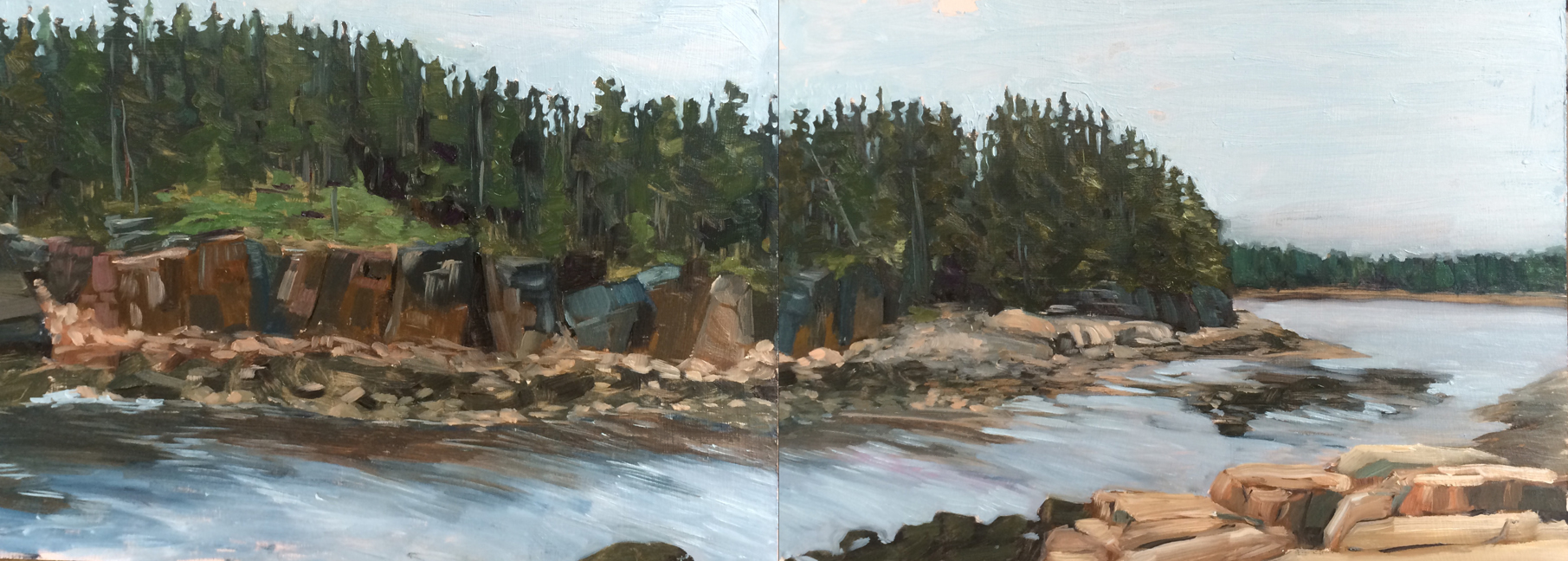
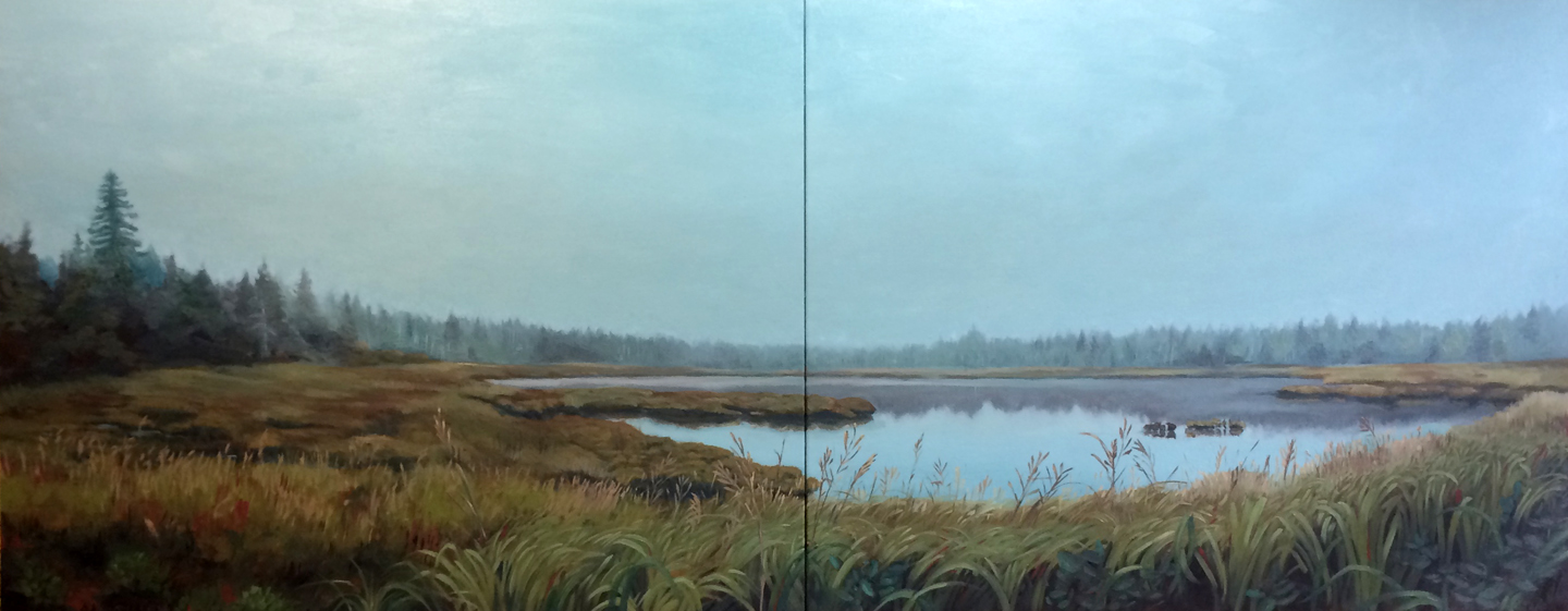
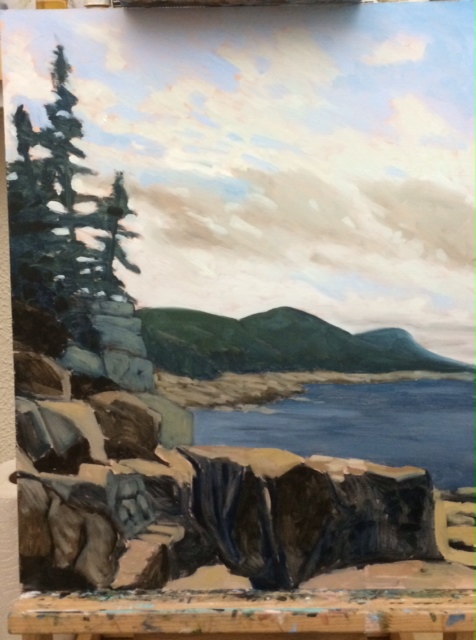
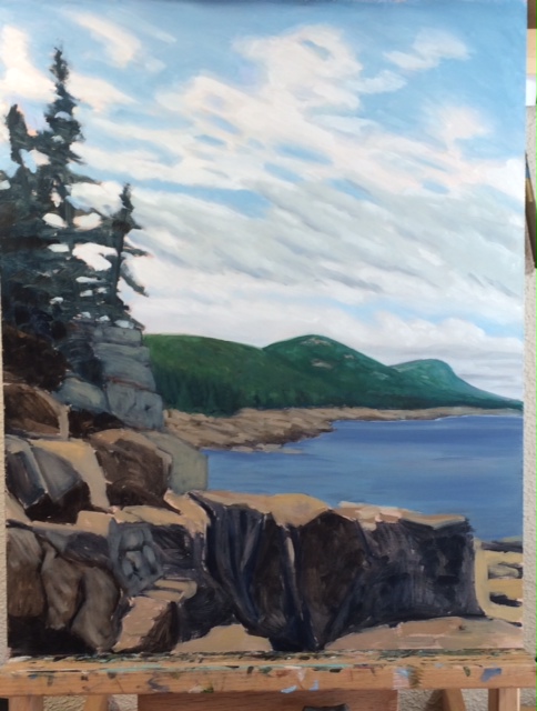
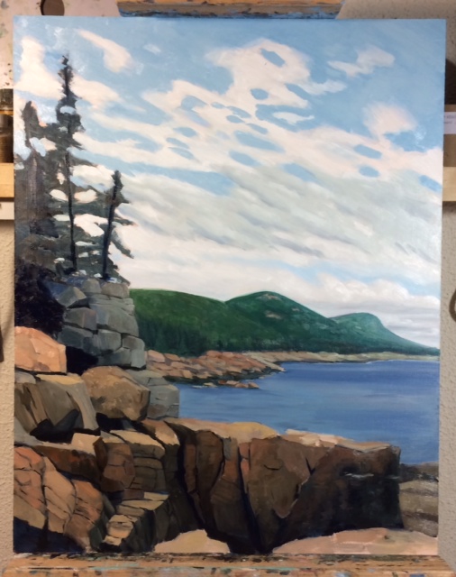
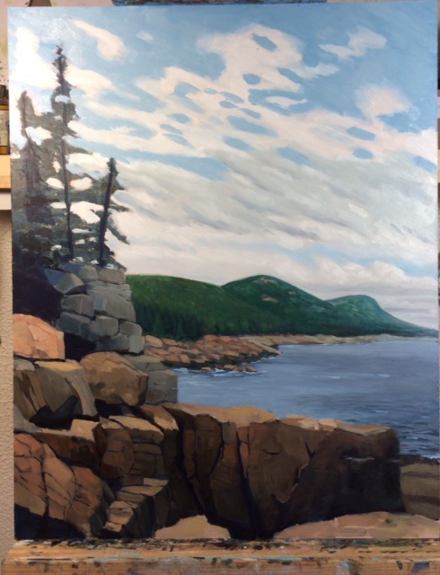
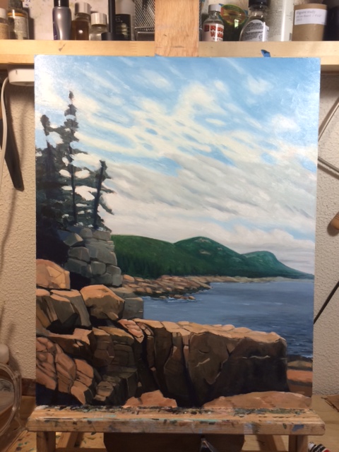
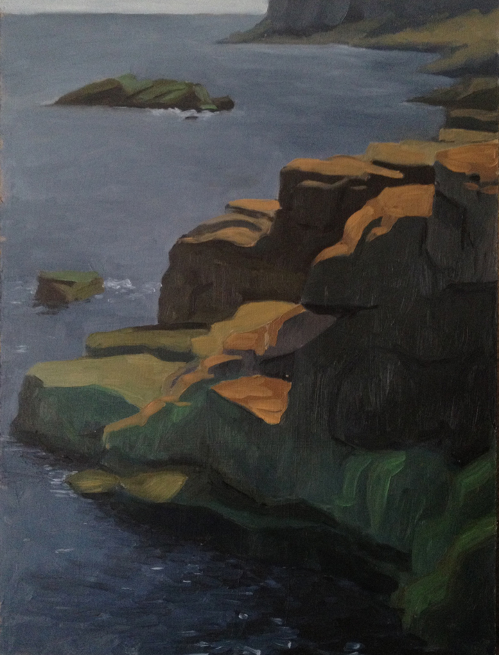
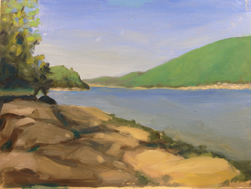
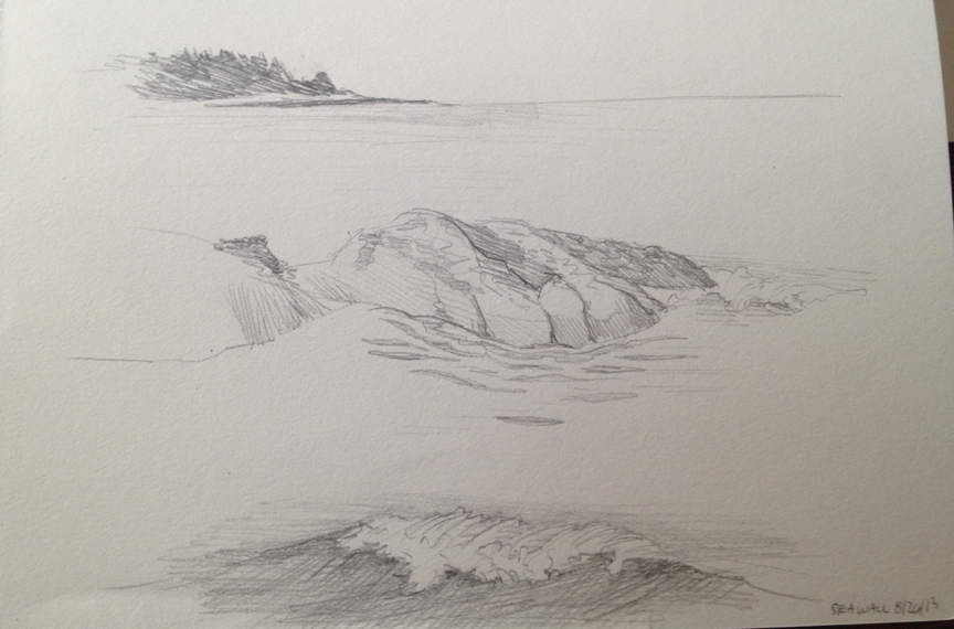
Fifth Day : More cliffs.

untitled : Oil on board. 9"x24"  2015

untitled : Oil on board. 9″x24″ 2015

This is from the same area I hiked all week.  I was tempted to go back and do more dead trees, but honestly it was getting a little depressing.  This was an ambitious piece – two panels side by side, and completed in the time it normally takes me to do one.

I’m very happy with the interplay of colors on the cliffs. I struggle a lot with the rock colors becoming too chalky or too orangey (see above).  I think these are one of the best representations I’ve done so far.  The tree line is a little too swoopy and the water got away from me.
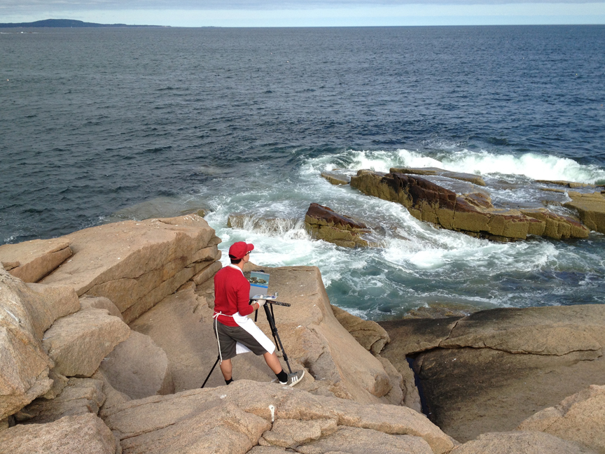
I was on an exposed part of the trail, which meant I had a lot of audience for much of the painting, which can be a little distracting. There was also a potential thunderstorm on the way which urged me along.  I finished painting just as the first drops of rain fell.

Two (almost) finished paintings!

Two paintings to start the week.  First is a little 8×10″ sketch that is almost finished… you may notice that there are shadows of electrical wires… but no actual wires above.  Once the sky dries I’ll paint in the rest.

Second is a larger scale piece I’ve been working on for a few weeks. It was a long process getting here, but I’ll detail that a little bit more on Tuesday’s post.

Enjoy!

Untitled Study : Oil on board, 8"x10". 2014

Untitled Study : Oil on board, 8″x10″. 2014

Untitled (cliffs) : Oil on board. 16"x20". 2014

Untitled (cliffs) : Oil on board. 16″x20″. 2014

Big Painting / Little Painting

I had done this horrid little sketch while up in Maine. While none of the paintings I did there were spectacularly successful this particular one stood out as particularly bad, for many many reasons.

Untitled : Oil on board. 9"x12" 2014

Untitled : Oil on board. 9″x12″ 2014

After staring at it for a few days and making notes of all the disastrous errors I decided to try again; I would consciously and carefully rework the idea.

I photographed the process and the results are interesting (at least to me).  Stepping back from the immediacy of the situation allowed me to understand what went wrong the first time, and to actively correct it (for the most part) this time.

First was the drawing.  I had rushed the drawing on the sketch, and my brain pulled one of those classic tricks: it said “wow those hills are dramatic” and instructed my hand to make them very dramatic. The result is a cartoonish exaggeration of what my eyes actually saw. Yes, the hills had a sharp rise, but that was visually tempered by distance and atmospheric perspective.

Step One: Drawing and blocking in.  I spent almost as much time on this step alone as I had on the entire sketch above. I focused on the subtleties of the shapes of the hills, noting that they weren't just symmetrical bell curves rising from the rocks.

Step One: Drawing and blocking in. I spent almost as much time on this step alone as I had on the entire sketch above. I focused on the subtleties of the shapes of the hills, noting that they weren’t just symmetrical bell curves rising from the rocks.

Step 2. I solidified the hills and pushed them backwards with cooler blues & greens.  I also "fixed" the sky... which was my biggest regret.

Step 2. I solidified the hills and pushed them backwards with cooler blues & greens. I also “fixed” the sky… which was my biggest regret.

Step 3.  More work on the hills and a great amount of focus on solidifying the rocks in the foreground.  I also continued to fuck up the sky...

Step 3. More work on the hills and a great amount of focus on solidifying the rocks in the foreground. I also continued to fuck up the sky…

Step 4. I reworked the water, which had been a little flat and a little too blue.  I added some texture and depth to the shore as it receded.

Step 4. I reworked the water, which had been a little flat and a little too blue. I added some texture and depth to the shore as it receded.

Step 5. I finally got the sky somewhere manageable - although not nearly as beautiful and soft as the initial blocking...I also brought in the highlights on the rocks in the foreground.

Step 5. I finally got the sky somewhere manageable – although not nearly as beautiful and soft as the initial blocking…I also brought in the highlights on the rocks in the foreground.

Final.  The last steps were to painting the greenery and trees.  I'm about 85% happy with it.  I still think the sky got mangled and some of the greenery is a bit amateurish.

Final. The last steps were to painting the greenery and trees. I’m about 85% happy with it. I still think the sky got mangled and some of the greenery is a bit amateurish. The photograph doesn’t capture the subtle blues in the foreground shadows.

Six Mediocre Paintings in 4 Days

Last week was another vacation in Acadia national park up in Maine.  As usual I brought along my painting supplies because there are a million gorgeous and inspiring views. Last year I’d completed a few paintings that were nice little studies.  This year the results were mostly mediocre and I’m trying to ascertain why.

So….

Untitled : Oil on board. 9"x12" 2014

Untitled : Oil on board. 9″x12″ 2014

1. Seawall. (Tuesday morning) I was drawn to the scene by the interplay of the back lit rocks with the sparkling of the ocean.  I also wanted to capture a sense of depth with the soft coloration of the peninsula in the background.

Good: First time painting out of the studio since 2013.

Bad: Well…everything.

  • The coloration of the background has too much contrast to give a sense of depth
  • the drawing is also a little off – the peninsula should be about 30% smaller and narrower
  • the rocks could have used a steadier hand and better color temp. to really emphasize the crisp lighting
  • …but by and large the worst bit for me is the ocean – it screams “amateur!”  It’s too blue, too wavy, too muddy… I didn’t capture any of the crisp bands of color that I actually saw
  • Lastly: I set this painting on the porch to dry and within an hour it was covered in little black bugs.  I commandeered the closet shelves for the rest of the paintings to dry.


Untitled : Oil on board. 9"x12" 2014

Untitled : Oil on board. 9″x12″ 2014

2. The Point.  (Wednesday morning) The next day I decided to visit the ocean cliffs which had provided some good paintings last year.  By and large I think this is the best painting of the trip.

Good:

  • The drawing was concise;
  • I spent time planning the color scheme and temperature
  • the island in the background is the correct softness to emphasize depth;
  • the ocean is banded in to color better.

Bad:

  • The trees feel a little wonky and chunky along the top.  I was using Viridian, which is quite transparent and so the whole mass of trees feels a bit unfinished, like an under-painting.  I may touch these up once its dry in a few days.


Untitled : Oil on board. 9"x12" 2014

Untitled : Oil on board. 9″x12″ 2014

3. The Sound. (Wednesday evening) After the success of the last painting I was eager to go out again…but I wasn’t really sure where. I drove to a couple spots I thought might work, but each one was problematic – too public, the wrong lighting etc.   The sun was on it’s way down and I was getting frustrated when I spotted a pull-off near a private beach.

Good:

  • Quick! This painting was done in less than an hour, including set up and take-down.
  • I carefully planned the progression of blue-greens to emphasize the depth of the mountains – they are still a bit too dark – but better than the cliff painting below.
  • The color temperature is mostly correct

Bad:

  • Composition.  The piece feels kinda like a thrift-shop painting, with the two points of land jutting in from each side, and the dramatic hills in the back.  I think adding one or two of the yachts that litter the sound would help bring a sense of scale and perspective
  • The values are a bit off – especially in the trees nearest the foreground.  They could be brightened up a little to emphasize the setting sun
  • I’m like kinda maybe pretty sure I was trespassing


Untitled : Oil on board. 9"x12" 2014

Untitled : Oil on board. 9″x12″ 2014

4. Trees. (Thursday morning) Lance suggested I take a break from the ocean painting to try something new. We spent an hour hiking the interior of the island looking for a spot to paint.  I finally settled on this view with a pair of large rocks and a tree sitting just off the path.

Good:

  • A new subject matter!
  • Much of the light and shade values feel correct
  • I saw a mink dart across the path while I was painting

Bad:

  • I was set up in the bright sun looking into darker woods.  The glare from the white palette screwed up my eyes.  I should have picked a shadier spot
  • The color temperature is wrong because of the sun – I couldn’t get an accurate gauge on how saturated the brown was, so the background doesn’t feel correct
  • Ditto for some of the foreground rocks
  • Changing light – this matters a LOT when the scene is dependent on sun dappling.  In 30 minutes the light spots moved about 2 feet!


Untitled : Oil on board. 9"x12" 2014

Untitled : Oil on board. 9″x12″ 2014

5. Cliffs. (Friday morning) I dragged Lance back to the ocean side on Friday to work on some more cliffs. I found an incredibly steep path that gave me a gorgeous view of the dramatic cliffs rising up from the ocean, with a backdrop of the Beehive and Gorham Mtns.

Good:

  • An amazing view!
  • I really enjoy painting cliffs

Bad:

  • The drawing is wrong – from the scale of the background cliffs, to the shape and scale of the mountain, to the beach cliffs in the background
  • Composition is wrong.  I wanted to emphasize the vertical thrust of the cliffs… but I also wanted to have the dramatic mountains in the background.  I should have focused on the former and turned the panel 90 degrees
  • The cartoonish character of the mountains again conjures up thrift shop paintings. I realized that even though the mountains are dramatic I was over-scaling them.
  • Again, using Viridian which left the mountains feeling unfinished and messy
  • The sky was moody and half cloudy, half clear.  I was running over time so I didn’t have a chance to work this out as carefully as I should have
  • Color temp is way off and the whole thing is muddy.  I was running low on turpentine and wasn’t as careful cleaning my brushes between areas.  It shows


Untitled : Oil on board. 9"x12" 2014

Untitled : Oil on board. 9″x12″ 2014

6. Little Long Pond. (Friday evening)  I left Lance at the hotel Friday night and set out to find one last spot to paint.  I stopped at one pond, but wasn’t moved, and so dashed over to Little Long Pond to catch the sunset on the meadow and Penobscot Mtn.  The cloud cover killed any dramatic lighting and I was left with a peaceful, cool scene that (thankfully) stayed the same for an hour.

Good:

  • I focused on the drawing and scale of the mountains.  I’d realized that my brain wants to draw them much larger than they actually appear, which leads to that cartoonish quality.
  • Better handling of color temperature…mostly
  • Attention to composition – the focus for me was the dramatic rise of the mountain over the sweeping meadow
  • Less focus on details, more on massing – which I think is what give the painting a better sense of depth

Bad:

  • Mosquitoes – lots and lots of mosquitoes…Its difficult to focus and paint when you’re flailing your arms all over the place
  • Greens.. are hard. Especially when you want to capture a yellowy green but in a cool light, so it doesn’t appear to sunny.  Still working on this part.  The large band of trees could have used a better contrast between the greens
  • The large trees in the front right were one of the last bits to be painted.  I was tired, and being eaten so I rushed through them.  Better handling would have given a better sense of depth


Overall it was a great trip, and I think I’ve figured out much of what went wrong.  The rest is just practice, practice, practice!!

Fluffy Clouds!

In advance of spring’s arrival – or maybe out of simple winter escapism – I worked on a couple of light fluffy cloud studies this past week.

Number 1 is from the ocean walk in Ogunquit, ME.  It was maybe an hour and a half – two hours.  It feels stiff by comparison to the second one, but I like both.  They were helpful in understanding some of the structure and coloration of the clouds.

Number 2 is from the top of Cadillac Mountain in ME.
I’ve also been busy practicing perspective drawing again – perhaps I’ll post some of those this week too!

Cloud Study #2 : Oil on canvas board. 8"x10" 2014

Cloud Study #2 : Oil on canvas board. 8″x10″ 2014

Cloud Study #1 : Oil on board. 8"x10"  2014

Cloud Study #1 : Oil on board. 8″x10″ 2014

Acadia Painting 5/5

On the last day of vacation Lance and I once again went to the loop road and climbed out on the rocks.  It was the perfect, beautiful, sunny way to end a long relaxing, exciting, art-filled week.

Otter Cliffs : Oil on Board. 9"x12"  2013. painted on site.

Otter Cliffs : Oil on Board. 9″x12″ 2013. painted on site.

Best of all, I got a great painting out of it and I learned that, when standing in direct sunlight, your colors are probably darker than you imagine 🙂

Also, there were a few other sketches that I did from around the island.

The Rocks at Seawall : Pencil. 5"x7" 2013

The Rocks at Seawall : Pencil. 5″x7″ 2013

Upper Hadlock Pond : Pencil. 5"x7" 2013

Upper Hadlock Pond : Pencil. 5″x7″ 2013

Some Notes on Waves : Pencil. 5"x7" 2013

Some Notes on Waves : Pencil. 5″x7″ 2013

View of Little Long Pond : Pencil. 5"x7" 2013

View of Little Long Pond : Pencil. 5″x7″ 2013

View From Beech Mountain : Pencil. 5"x7" 2013

View From Beech Mountain : Pencil. 5″x7″ 2013

Acadia 4/5

Almost done with all my Acadia stuff.  The last couple of days there I convinced Lance to come to the rocky side of the island with me and he hung out and read while I painted.

It was rather beautiful to be standing on the edge of the rocks gazing into the ocean.  Until the ocean started getting closer as the tide came in.  Lance nabbed this photo.

Adam painting.

Adam painting.

The painting was done on half of a 9×12″ board.  It came out decent.  One of the things I caught myself doing was compressing some of the elements to make them fit onto the board.  The small hash marks on the top corners are from small bull-dog clips that I use to stack wet paintings without them touching one another.

Ocean Rocks : Oil on Board. 9"x5.5"  2013. painted on site.

Ocean Rocks : Oil on Board. 9″x5.5″ 2013. painted on site.

Acadia Painting 3/5

If you’ve ever been to Mt. Desert you know that Maine fog is a mysterious and frustrating thing!  On Wednesday I dropped Lance off in Bar Harbor, where the afternoon sun was dappling the lawn of the common. I made my way towards the ocean and upon reaching the rocks was immediately engulfed in fog.

The thin line in the back of the painting is the same beach we’d been to the day before.  Suffice to say I’m glad we made it to the beach when it was sunny.

Sand Beach In Fog : Oil on Board. 9"x12"  2013. painted on site.

Sand Beach In Fog : Oil on Board. 9″x12″ 2013. painted on site.

Acadia Painting 2/5

So before August of last year I hadn’t done much oil painting since I graduated college in 2002.  As Lance and I were packing for Acadia in 2012 I decided, on a whim, to bring along my old box of oil paints and some masonite panels.   The first full day of vacation Lance and I hiked along the edge of Somes Sound – the fjord that cuts up the center of Mount Desert Island.

After a few hours of hiking we cut down to the water level and I decided that if I was going to paint, that was the time.  It was awkward and windy, and the first result was clumsy, but it started me down the path to where I am today. (click photos to enlarge)

Somes Sound : Oil on masonite.  9"x12" (NFS) Painted on site.

Somes Sound : Oil on masonite. 9″x12″ (NFS) Painted on site.

Last week I revisited the spot to repaint it on the one year anniversary.

The Flying Mountain trail winds along the edge of a steep embankment a few hundred feet above the water.  The trail is literally cut into the rock face in parts, and offers dramatic views up the Sound and across to Nuremberg and Parkman Mountains.

Setting up my easel on the edge of Flying Mountain. 2013.

Setting up my easel on the edge of Flying Mountain. 2013.

I was able to get a glimpse of my original painting site (the nearer of the two points on the right), which was under water due to the tide, so I decided to stop where I was, perched on the edge of a giant granite boulder tumble, and set up my easel.

I spent about 2 peaceful hours there.  Almost no sounds except the occasional boat motoring up the fjord. I spotted an osprey hunting below me, and was visited by a remarkably curious/fearless red squirrel.  The resulting painting perfectly captures the late afternoon feeling.  It’s a little sweet, and the water on the right side got muddied with some stray orange, but overall I’m happy with it.

Somes Sound Overlook : Oil on board. 9"x12"  2013. painted on site.

Somes Sound Overlook : Oil on board. 9″x12″ 2013. painted on site.

Earlier Tuesday morning Lance and I had gone to Sand Beach, on the eastern-most part of Mount Desert Island.  The beach is a tiny channel with steep cliffs rising on either side, and a stunning view of the Beehive Mountain directly behind it. I spent a good amount of time sketching the cliffs.

Looking out from Sand Beach : Graphite 5"x7" 2013

Looking out from Sand Beach : Graphite 5″x7″ 2013

Looking North from Sand Beach : Graphite 5"x7" 2013

Looking North from Sand Beach : Graphite 5″x7″ 2013

Looking out from Sand Beach : Graphite 5"x7" 2013

Looking out from Sand Beach : Graphite 5″x7″ 2013

Acadia Painting 1/5

August is incredibly busy at my job, and the month ended with a much needed, and much enjoyed vacation to Acadia park in Maine. For those who are unfamiliar Acadia is on Mt. Desert Island – a weird and beautiful place, complete with dramatic mountains, rugged cliffs jutting into the ocean, gorgeous boreal forests, a fjord, and truly breathtaking views.

It is a landscape that inspired artists such as Edward Hopper, Frederick Church, and Fitz Hugh Lane. And me. I brought along my painting kit and my sketchbook again this year and spent 5 of the seven days making art.

First up is Seawall, painted on Monday morning.   Seawall is a cobble beach on the lower east side of the island, staring off into the Atlantic ocean and the outlier islands. Across the road are tall, eerie pine forests and quiet marshes.

Painting the ocean is challenging.  It’s always moving.  It was foggy one moment, and sunny the next.  By the time I finished drawing, mixing colors, and started painting the rocks in the bottom of the painting had half vanished under the tide.  An hour later they were completely submerged. And, of course, the composition is a little bland, with the horizon cutting just about halfway through the painting.   But still, it was the start of a very productive week!

Seawall : Oil on board. 9"x12" 2013. Painted on site.

Seawall : Oil on board. 9″x12″ 2013. Painted on site.

A panorama of the marsh behind Seawall beach.

A panorama of the marsh behind Seawall beach.

Graphite studies of the rocks, waves, and vistas of Seawall beach.  5"x7" 2013

Graphite studies of the rocks, waves, and vistas of Seawall beach. 5″x7″ 2013