Dreams #2

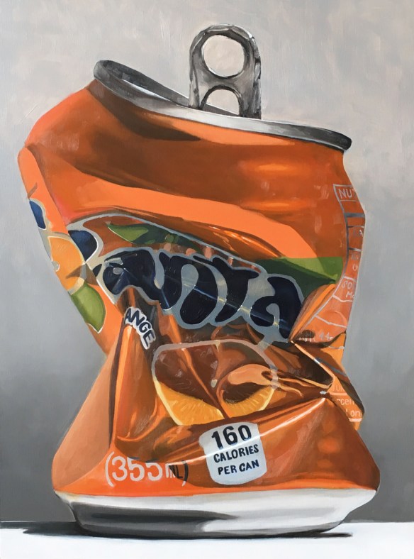
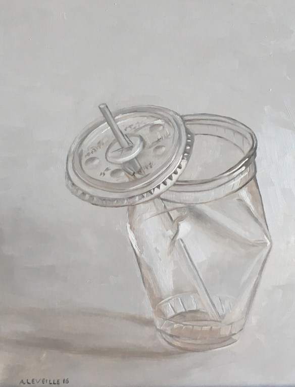
A few more weeks of work and I have finished Dreams #2, the second of the large scale can paintings.  Damn they are challenging!  In smaller paintings there is the ability for much more gestural and abstraction, but on a larger scale all that needs to be refined much more. Particularly of issue on this painting was the fine print near the recycle logo. I chose to move towards abstraction rather than pushing in the direction of photo-realism.  It is very important to me that these remain paintings, not a slavish photographic representation.

Dreams #1

After a couple dozen studies of soda and beer cans I launched into a large scale painting.  It took several weeks to finish.  As I’ve mentioned in the past, scaling up paintings exponentially increases the working time.

The idea for the series has slowly come together. At first the cans were an exercise in color mixing and painting reflective surfaces, but as I worked on them I saw a deeper meaning.

dreams-1

Dreams No.1 : Oil on wood panel. 18″x 24″  2017

Winter Break

My winter vacation was a great time to get things done.  For about 9 days I had free rein to paint, organize, cook, clean, think, read, and learn, and play a lot of Boggle with Tim.  There were also trips to Harvard Art Museums, perusing Instagram and Youtube for knowledge/inspiration.  And pie.

Here’s a run-down of the art stuff:
gold-candy

Untitled (Surface Study) : Oil on wood. 8″x10″ 2016

1) Revisited the gold candy with the dark background.  The candy paintings have been on a white background, giving them a bright, almost clinical appearance.  I wondered if using a black background might change the feel.  It did, and I don’t immediately love with the look.  After looking at the painting for a couple weeks I pushed the background darker.  I also lightened up and solidified some of the highlights and added a glaze of Indian Yellow over the transparent foil ends.  All steps in the right direction. (sorry for the truly shitty photographs – a new camera needs to be in the future)

diet-coke-black

Untitled (Dreams Study) : Oil on wood. 8″x10″ 2016

2) Painted a can on a black background.  Again testing the idea of darker backgrounds for the solo objects.  I like this one better than the candy.  I also went back in after it was dry and glazed some of the reds to make them pop more.  This is using a direct studio lamp to light the model instead of daylight as on the past cans.

back-path

Echoes : Back field : Oil on board.  9″x12″  2016

3) Painted a path.  This was one of the reference shots I gathered at my father’s house over Christmas.  It seemed a bit too precious to build into a full size painting, but it made a nice exercise in color temperature in the snow.  I also worked on simplifying/massing the backgrounds of the trees, rather than paint each individual branch.

pie

Untitled (Substance Study) : Oil on wood. 8″x10″ 2016

4) Bake pie, paint pie, eat pie.  Prodding the idea behind the Substance series I expanded from donuts into pie.  Mostly because I had pie in the fridge. Surprisingly challenging to paint the simple surfaces without seeming boring. Not quite as colorful, but I think Wayne Theibauld would enjoy.

5) Freeze my f**king ass off. At the Harvard Art Museums I came across a Monet painting of a snowy road with the quote: “We glimpsed a little heater, then an easel, then a gentleman swathed in three overcoats, with gloved hands, his face half-frozen. It was M. Monet, studying some aspect of the snow.”

It was inspiring and on my return home I bundled up and attempted to capture ‘some aspect of the overpass.’  It was actually a lot of fun.  The cold definitely takes a toll on your cognitive process – about halfway through I forgot how to use color temperature.  Then the snow started. I really like the left side – I may cut it down to a 6×9″

6) Work on a sunny landscape/beach scene.  Which, for reasons I cannot discuss I cannot yet post.

diet-coke-white

untitled (Dreams Study) : Oil on wood. 8″x10″ 2017

7) Painted a can on the white background with direct light.  The direct light on the model significantly changes shadows and highlights.  It may be what I use for the larger scale paintings.

8) Annual New Year Studio Cleanup!  Lastly, I spent January 2 cleaning up and streamlining my studio space. Fresh start to a new year!

studio-cleanup

Some weekend work

I haven’t posted in a couple weeks because I have been plodding through a larger piece. It’s coming along, slowly and with effort.  I’m at the point now where I wish it finished for the sake of it being finished;  I know if I set it aside and work on something else I will likely never return to it.

Also, in advance of open studios I have been ramping up my painting on days that I don’t work my full time job.  Normally, on a day off, I will putz around the house, and paint for 2-3 hours in the afternoon.  In the past two weeks, however, I have spent a total of 5 days off, painting for a 2-3 hour stretch in the morning, and another 2-3 hour stretch in the afternoon.  That’s a lot of standing in front of the easel!

But it pays off!  This week, in addition to the work on the larger painting, I completed two smaller works.  Thanks to the urging of friends, what started out as exercises have developed into small series.

Green and Orange and Green

Still playing with surface, reflections, throw-away-culture, and a limited palette.  These have moved somewhere past the exercise of the candy and beer cans and slightly into an idea.


Red, white, and light blue

Two paintings from the weekend exploring reflective surfaces again.  The PBR can was a lot of fun – the amount of detail work made it challenging in the best way.  The blue candy was for my friend Zachary, a photographer from NYC who is pushing me to keep going with the cans/candy.

The candy was done with 3 colors: Ult. Blue, Burnt Umber, and Cad Yellow (plus white). The can was done with the same, plus Cad Red Lt. I love working with a limited palette!

Shiny Shiny

This month I spent a week in Maine painting landscapes (images coming soon!).  The experience once again drove home how challenging landscape painting is for me: from siting locations, to handling trees, to edge control, to atmospheric perspective.

So as a treat to myself when I returned home I spent this weekend doing studies of hard-edged, candy-colored, shiny things.

The cans were painted in 3 and 4 colors with a large brush – again, pushing myself away from the detail work I normally do. The red candy was 3 colors, but I did allow myself to use a small brush.

Silver

Another week, another beer can study.  I returned to small brushes and returned to my normal style after last week’s experiment.  Next week I may take the experiment in the opposite direction and do a layered/glazed painting of a can.  The printed aluminum is an ideal candidate for glazing and getting really deep, rich colors.

Big brush

I challenged myself to do this painting using a 3/4″ filbert brush instead of the 1/2″ and 1/4″ flats I normally use.  The flat brushes let me paint crisp edges and thin lines.  The filbert was an exercise in letting go and loosening up.  I also added a couple extra cans to push me for speed.

Corona

Another shiny beer can.  I think I’m going to attempt a different sort of back drop next time.  For the past several paintings I have spent an hour or two on the main subject, then mixed a greyish white with a bunch of medium to quickly paint in the background.  It leaves the objects hovering in some weird non-space.  I like that at some points, but I think it may also feel a bit formulaic.

Cons: the shadows on the white can were hard to get the color temp just right.

Pros: It was surprisingly fun to paint the calligraphy upside down.

Plastic Cup

This is something new.  Partially inspired by the cans and candy paintings, but also more of an idea forming in the background.  This particular study was extremely challenging, and is not exactly what I was going for, but is headed in the right direction.  Perhaps there will be more.

Plastic Cup 1

untitled (plastic cup) : Oil on Board. 14″x18″  2016

Feeling blue…


A set of studies from this past week/weekend.  I find myself drawn to the reflective and hyper-saturated colors of manmade objects more and more. They are a completely different challenge than landscapes: hard vs soft, defined edges vs atmosphere, saturated colors vs a millions shades of neutral.