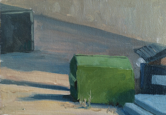
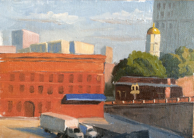
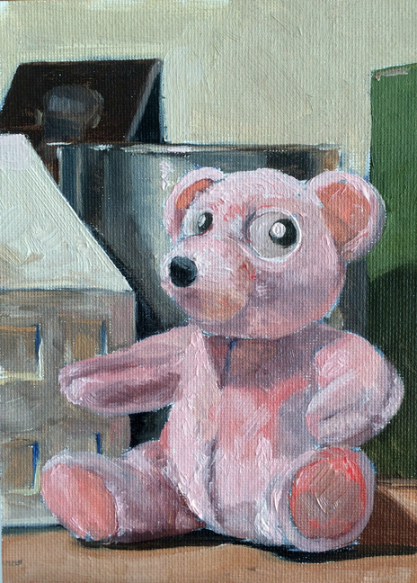
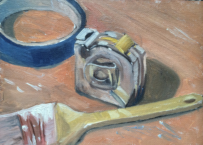
Two weeks ago I made a series of small (5″x7″ paintings) using a limited palette of red, blue, yellow, brown, and white. This week I made another set of paintings using the same limited palette, but adding a warm and cool version of each color, and removing (mostly) the brown.
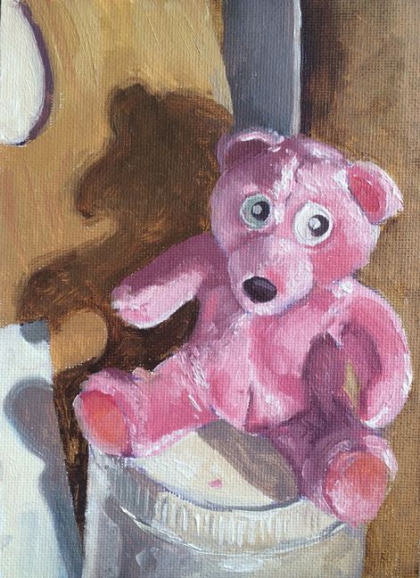
In some instances it made a much clearer painting. See how much more pink the teddy bear is when I can use Alizarin Crimson instead of Cad Red Light. In other areas it added some frustration since I had to both focus on color mixing, as well as color temperature. Also – I’m learning that a concrete floor is not the best surface to work on. I see some rubber pads from Home Depot in the near future.
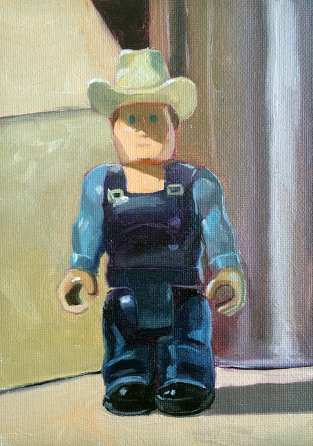
The strongest paintings are Teddy and Cowboy. The weakest is the evening Embankment. The evening light was fading fast and I was rushing.
untitled sketch : Oil on canvasboard. 5″x7″ 2015
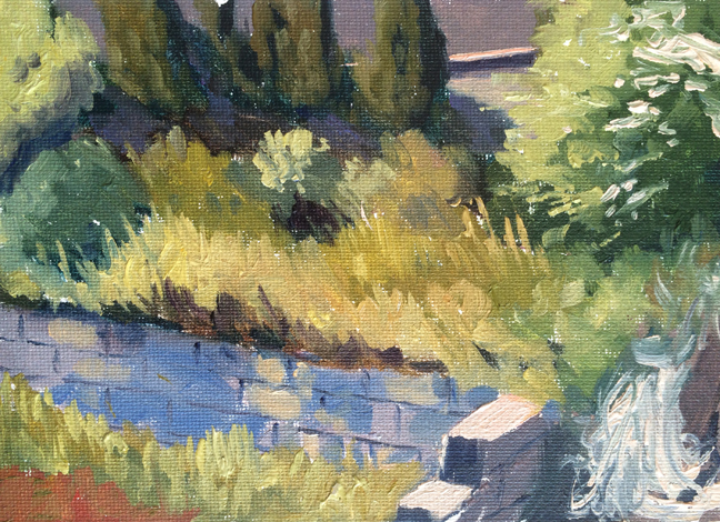
untitled sketch : Oil on canvasboard. 5″x7″ 2015
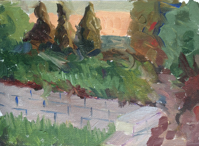
untitled sketch : Oil on canvasboard. 5″x7″ 2015
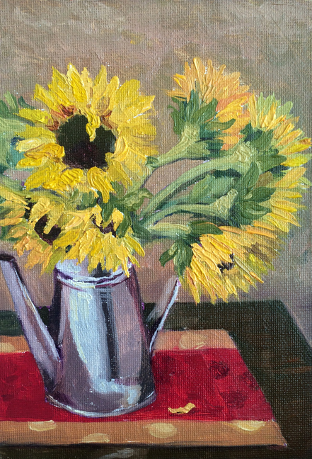
untitled sketch : Oil on canvasboard. 5″x7″ 2015
untitled sketch : Oil on canvasboard. 5″x7″ 2015