Color mixing is, perhaps, one of the hardest elements of painting for me. I can see (most) color accurately and know exactly what color I need for the painting… but how to get that color? That’s a little trickier.
Many painters advocate using a limited palette. That is, giving yourself only a few colors and mixing all else from there. In the beginning of an experiment/practice program I started this week using only four colors: Cad Red Light, Cad Yellow Light, Ultramarine Blue, Burnt Umber (brown) and Titanium White.
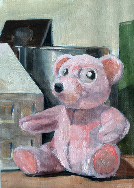
It is at once liberating and maddening. As you can see in the paintings below I’m able to get reasonably close to certain colors. Some – the pink in the teddy bear – were virtually unmixable given the 4 colors were all fairly warm colors.
Next week I will add 3 more colors – giving myself a warm and cool version of each color. As the colors above are mostly warm I will add Alizarin Crimson (cool red), Hansa Yellow Light (cool yellow), and Cerulean (warmer blue).
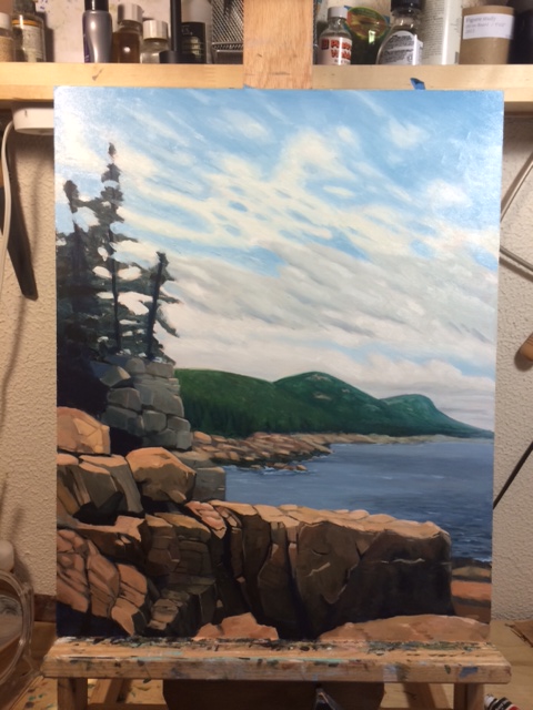
As for the subject matter… I looked out the window and around the studio for random things to paint. I’m still working on a lighting solution for the new studio. The overhead lights are halogen and very yellow – making it virtually impossible to see what a color will look like when it goes from palette to canvas.

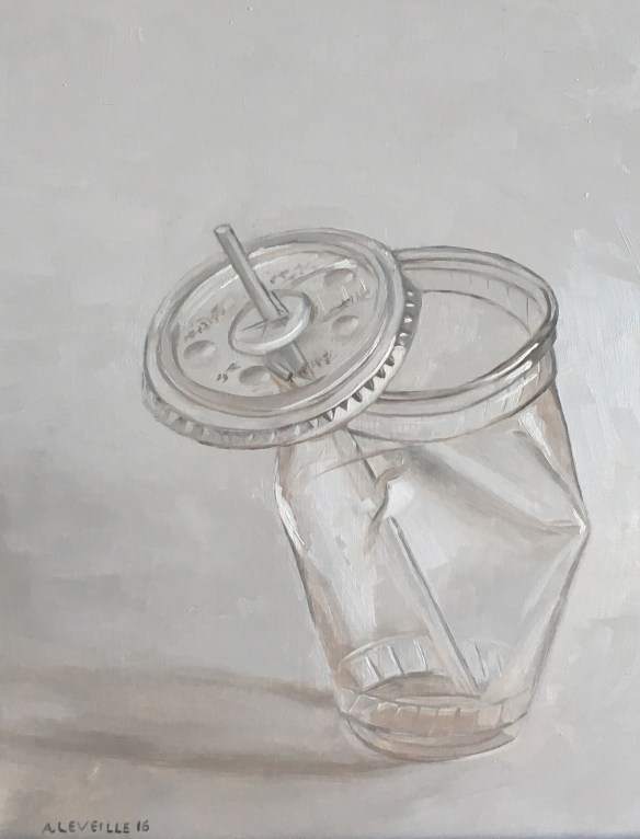
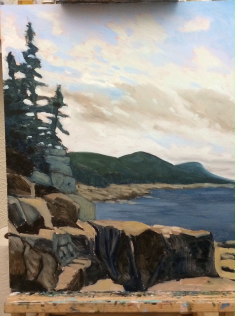
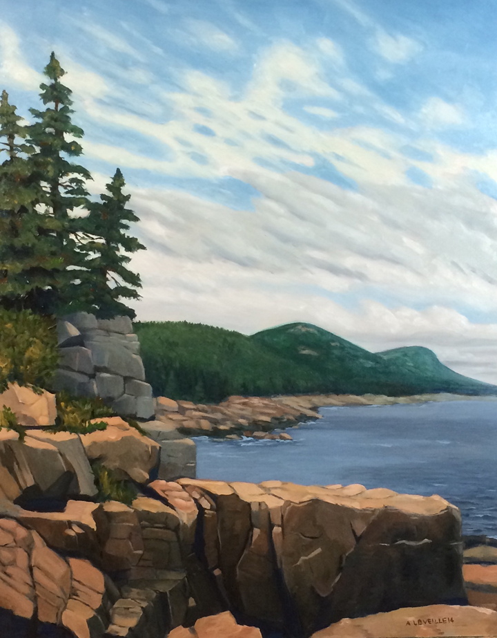
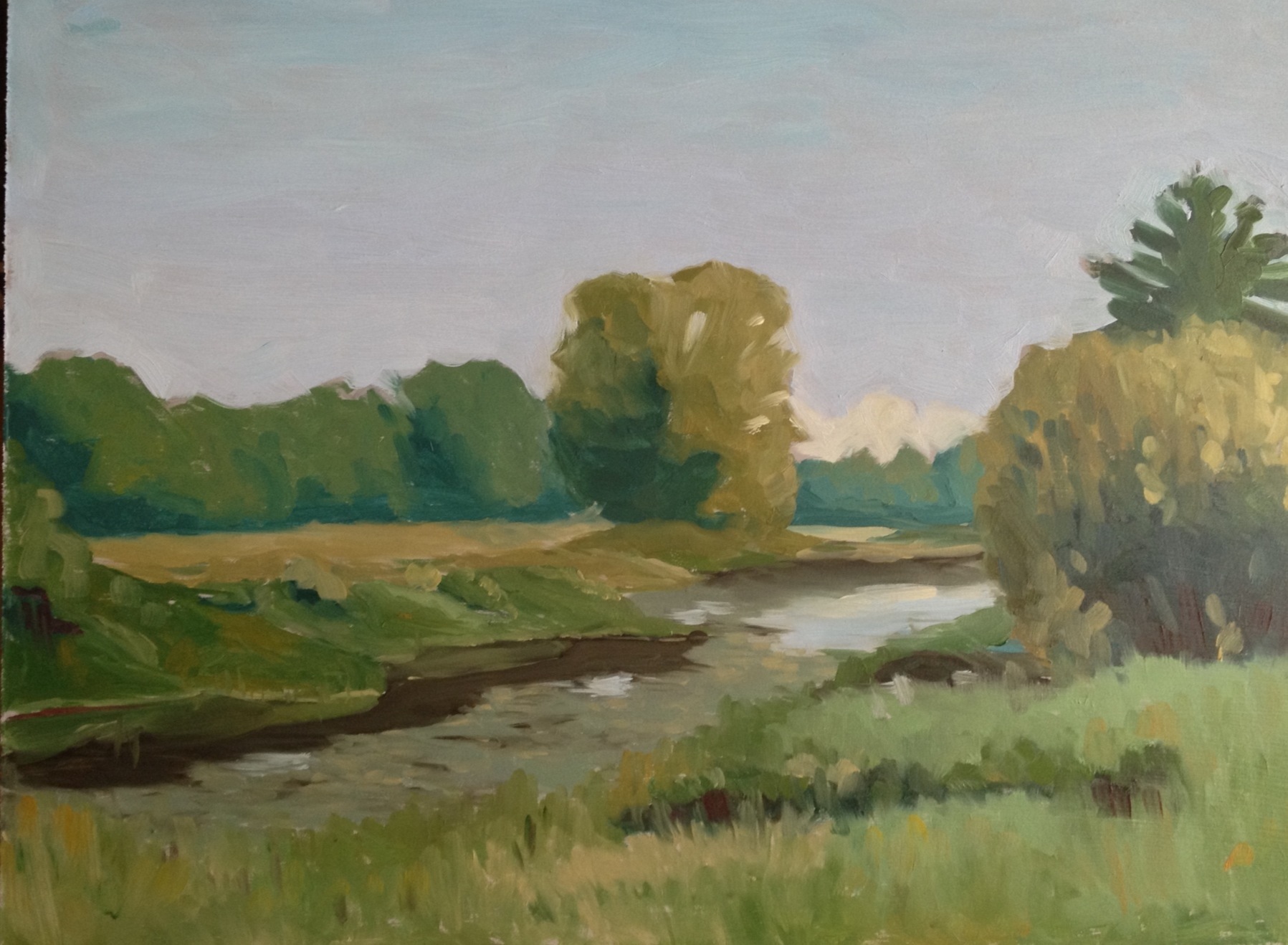
untitled sketch : Oil on canvasboard. 5″x7″ 2015

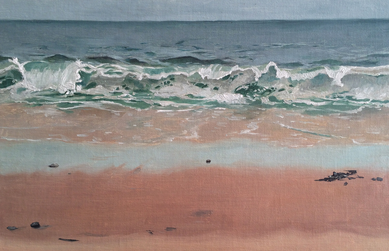
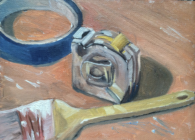
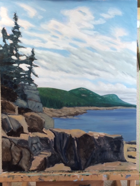
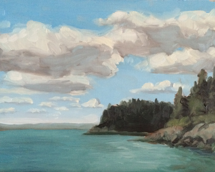
untitled sketch : Oil on canvasboard. 5″x7″ 2015

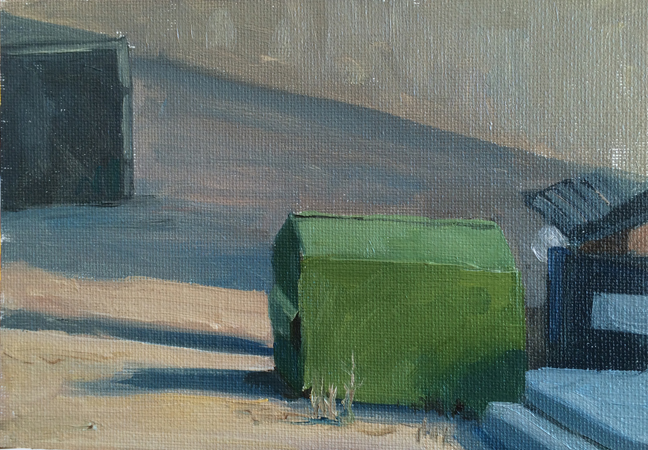
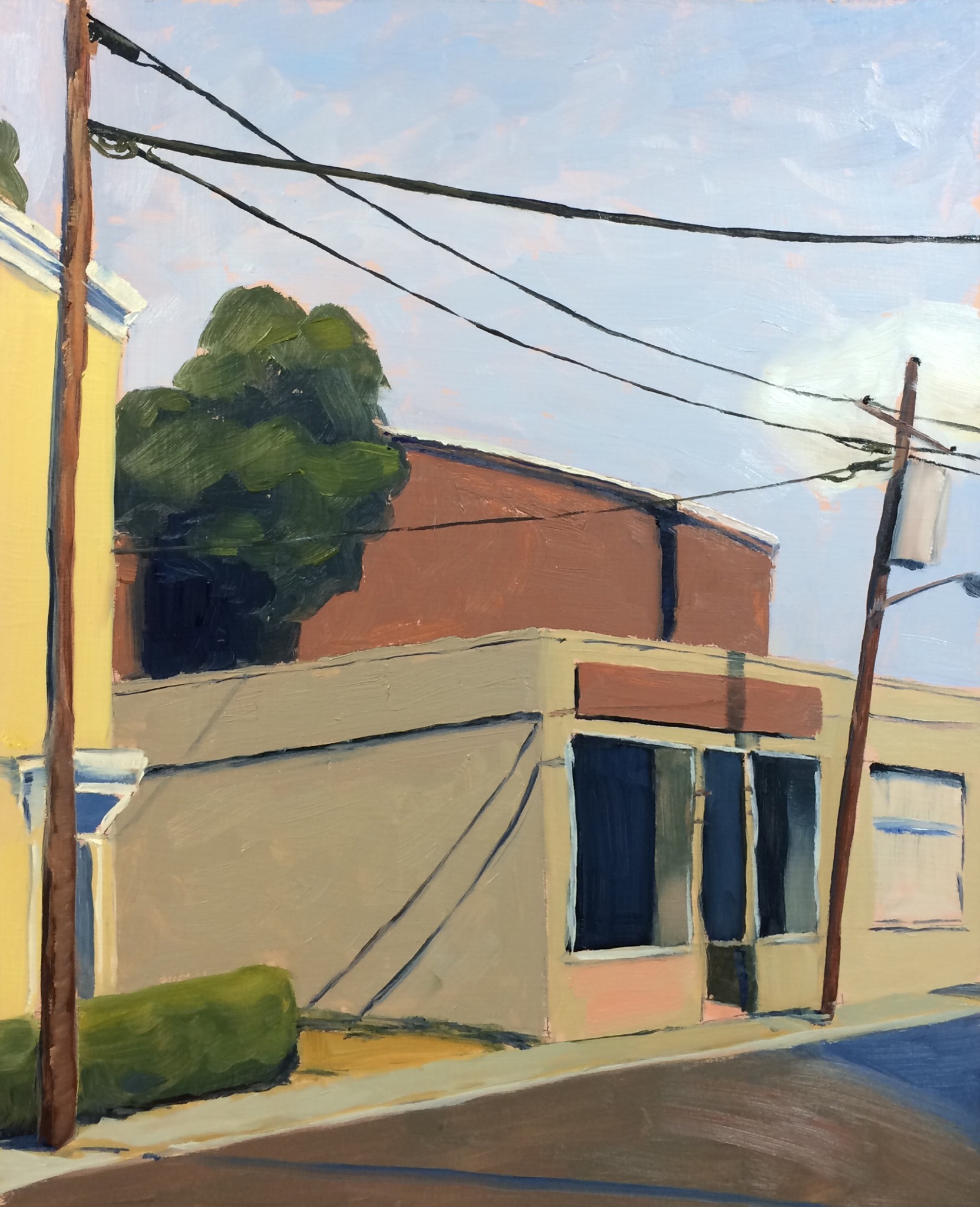
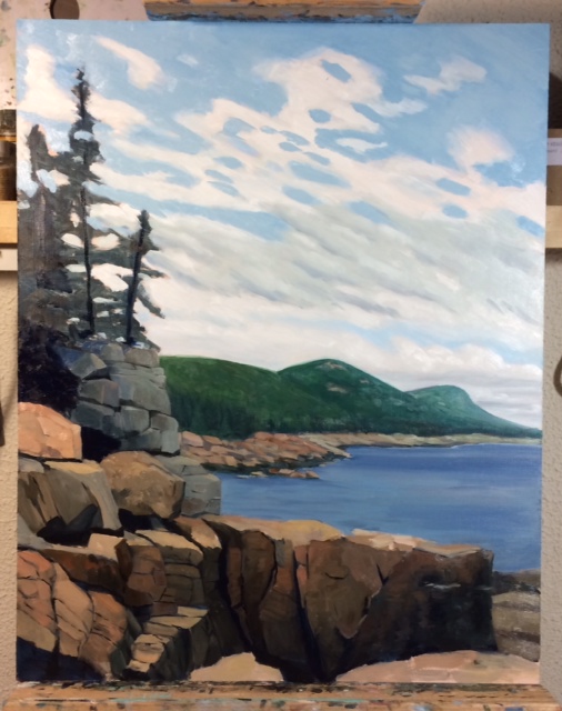
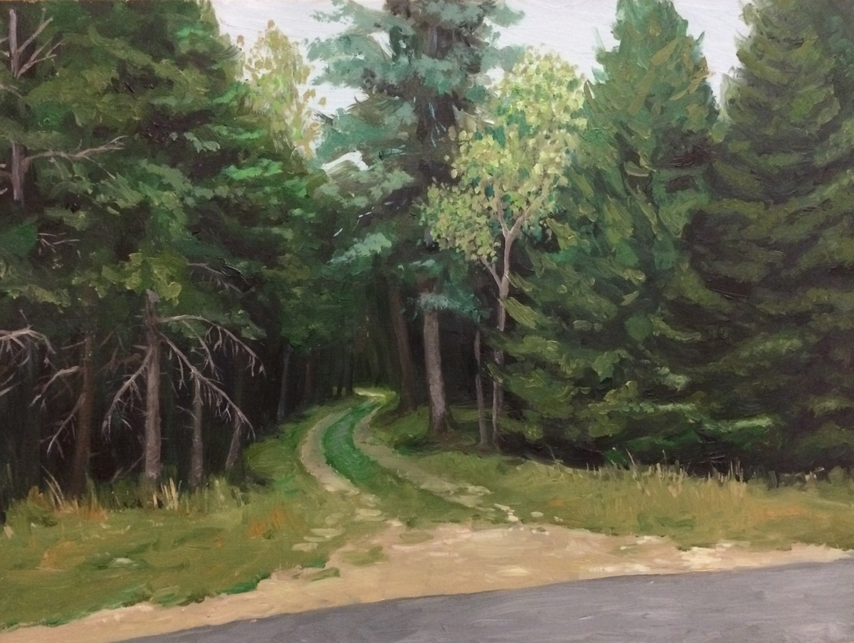
untitled sketch : Oil on canvasboard. 5″x7″ 2015

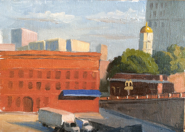
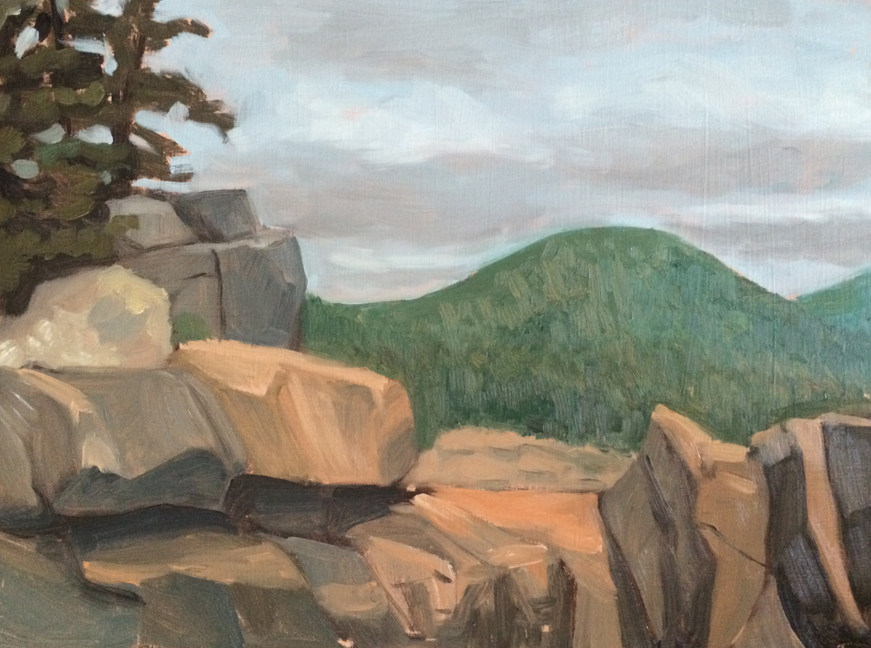
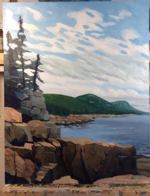
untitled sketch : Oil on canvasboard. 5″x7″ 2015

untitled sketch : Oil on canvasboard. 5″x7″ 2015