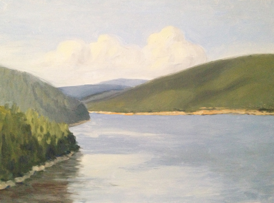
So before August of last year I hadn’t done much oil painting since I graduated college in 2002. As Lance and I were packing for Acadia in 2012 I decided, on a whim, to bring along my old box of oil paints and some masonite panels. The first full day of vacation Lance and I hiked along the edge of Somes Sound – the fjord that cuts up the center of Mount Desert Island.
After a few hours of hiking we cut down to the water level and I decided that if I was going to paint, that was the time. It was awkward and windy, and the first result was clumsy, but it started me down the path to where I am today. (click photos to enlarge)

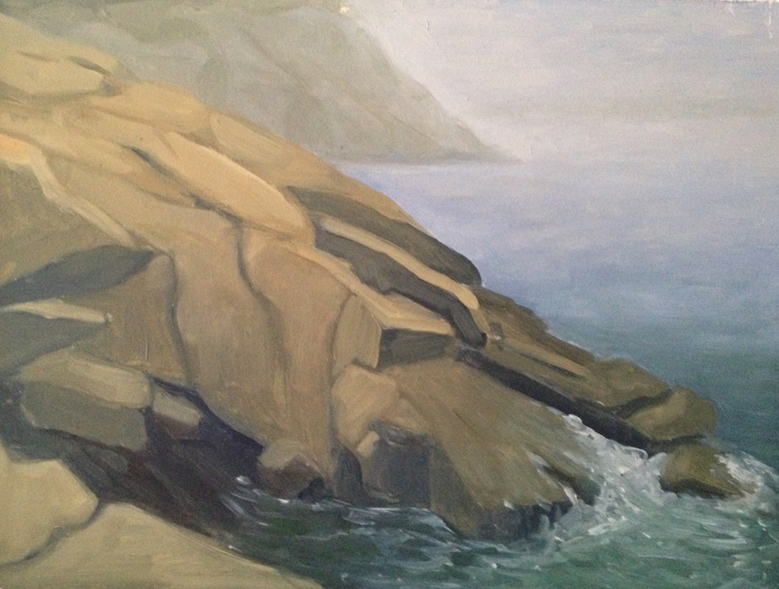
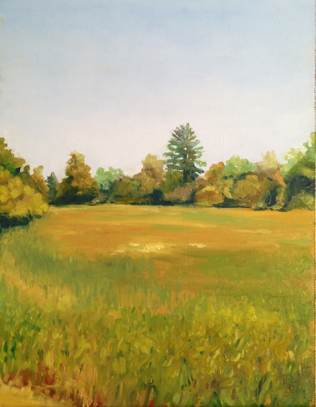
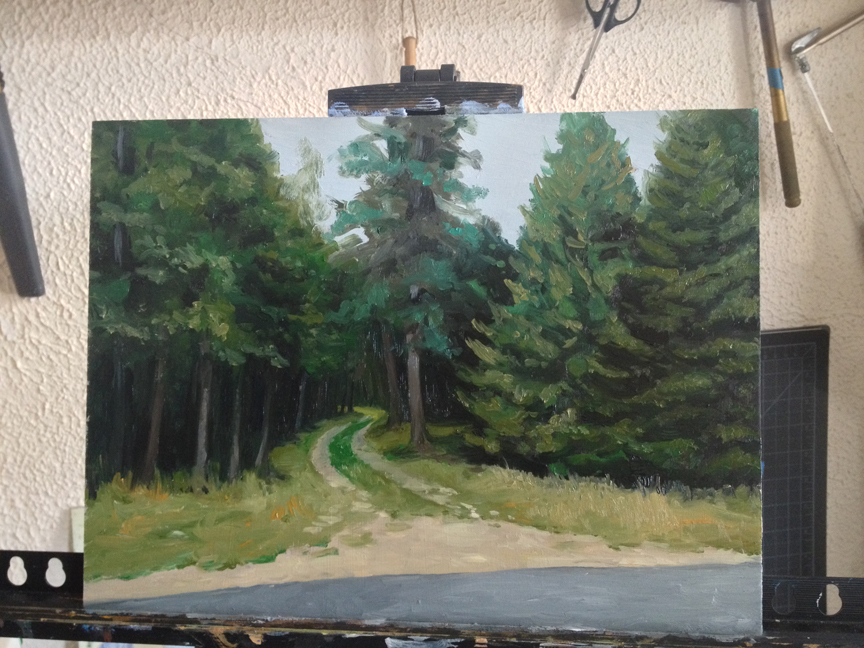
Somes Sound : Oil on masonite. 9″x12″ (NFS) Painted on site.
Last week I revisited the spot to repaint it on the one year anniversary.
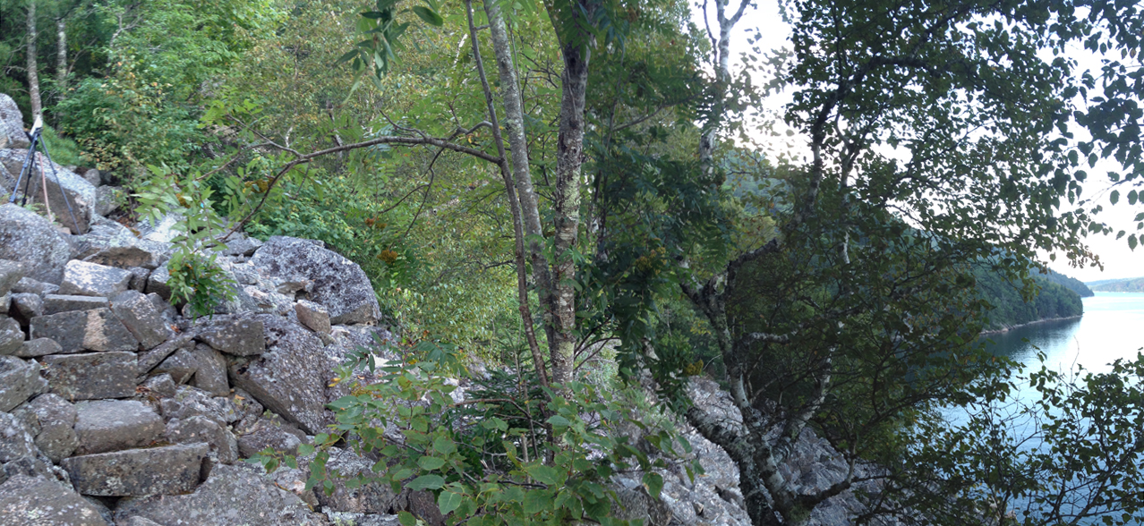
The Flying Mountain trail winds along the edge of a steep embankment a few hundred feet above the water. The trail is literally cut into the rock face in parts, and offers dramatic views up the Sound and across to Nuremberg and Parkman Mountains.

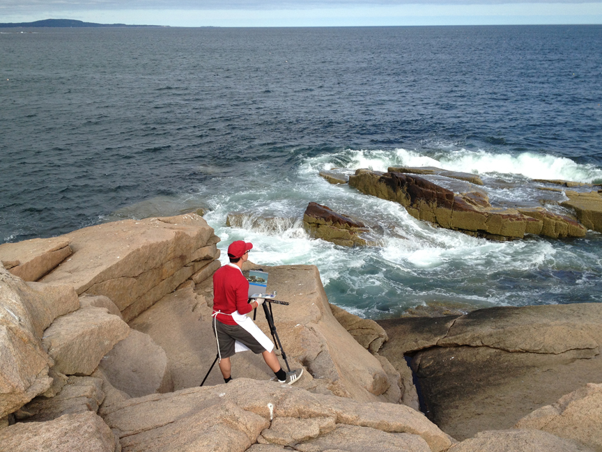
Setting up my easel on the edge of Flying Mountain. 2013.
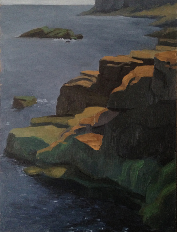
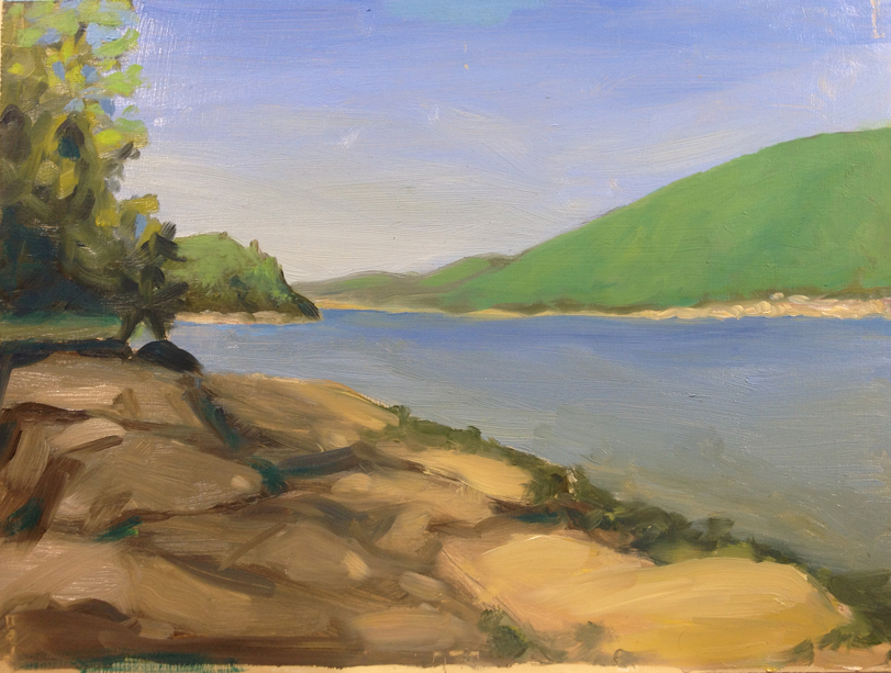
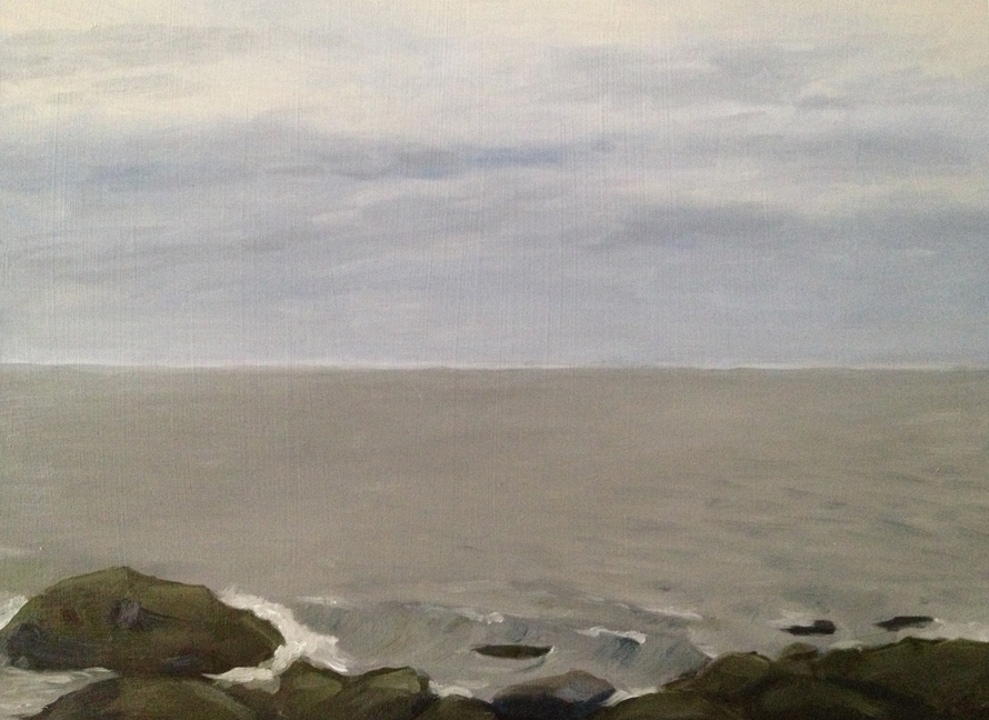
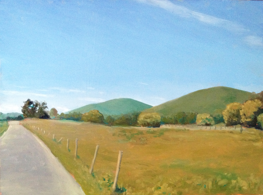
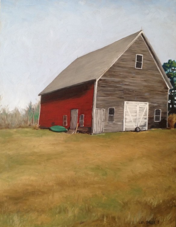
I was able to get a glimpse of my original painting site (the nearer of the two points on the right), which was under water due to the tide, so I decided to stop where I was, perched on the edge of a giant granite boulder tumble, and set up my easel.
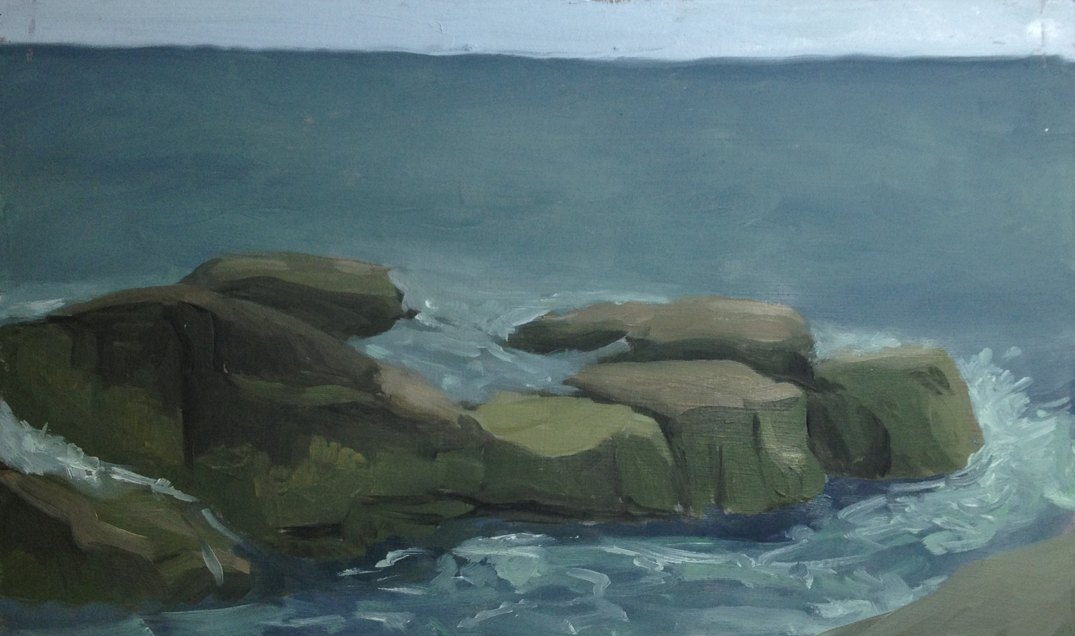
I spent about 2 peaceful hours there. Almost no sounds except the occasional boat motoring up the fjord. I spotted an osprey hunting below me, and was visited by a remarkably curious/fearless red squirrel. The resulting painting perfectly captures the late afternoon feeling. It’s a little sweet, and the water on the right side got muddied with some stray orange, but overall I’m happy with it.

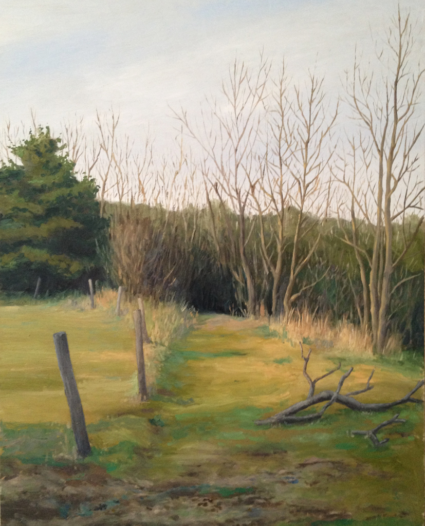
Somes Sound Overlook : Oil on board. 9″x12″ 2013. painted on site.
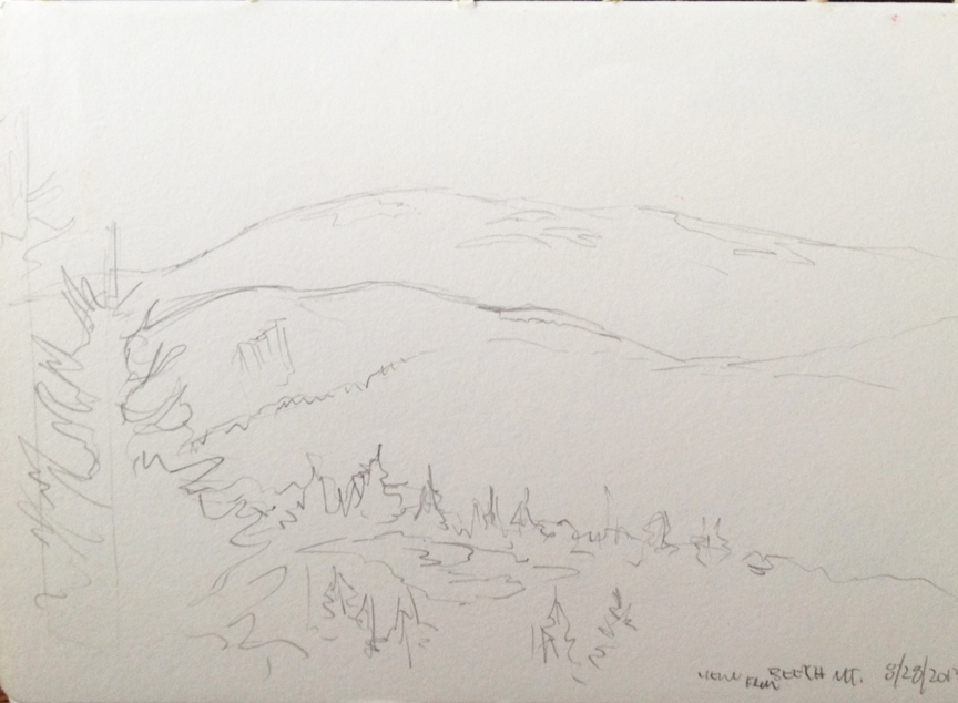
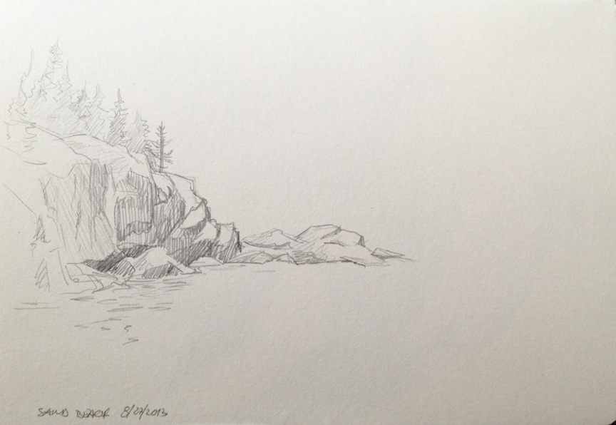
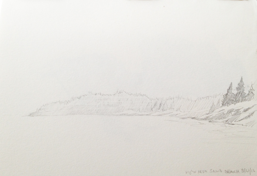
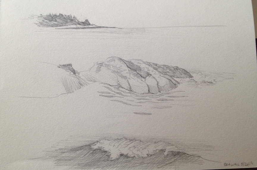
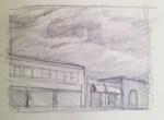
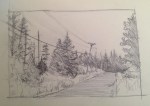
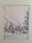
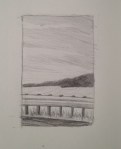
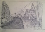
Earlier Tuesday morning Lance and I had gone to Sand Beach, on the eastern-most part of Mount Desert Island. The beach is a tiny channel with steep cliffs rising on either side, and a stunning view of the Beehive Mountain directly behind it. I spent a good amount of time sketching the cliffs.

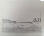
Looking out from Sand Beach : Graphite 5″x7″ 2013

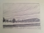
Looking North from Sand Beach : Graphite 5″x7″ 2013

Looking out from Sand Beach : Graphite 5″x7″ 2013